Learn how to create a Feedback Tool below.
Read Before You Begin
Read the following sections in blue before you create a Feedback Tool.
A Feedback Tool is used to collect information from a user in the form of a questionnaire.
There are two ways you can use a Feedback Tool:
- Place it on a Publication as a button where users can click the button and fill out the Feedback Tool questionnaire you create.
- Open the Feedback Tool in a browser on an iPad or kiosk and collect information directly from a user. For example, you can place an iPad on a stand and ask customers to fill out the questionnaire you create. Another example is someone can walk around carrying the iPad and ask people for feedback. Note: This option also requires attaching the Feedback Tool to a Publication. Also note the browser header will be hidden when viewing the Feedback Tool using a direct link.
When you create a new Feedback Tool you'll need to configure multiple settings and screens.
A Feedback Tool contains the following:
- Settings - Determine name, interviewers, full screen mode, notifications, etc.
- Welcome Page (optional) - Introduction screen welcoming users to your questionnaire.
- Questions (can be multiple screens based on your configuration) - See next blue box for details on the types of questions you can ask.
- Closing Page - Thank users for filling out your questionnaire and automatically start from the beginning or redirect them to a new page or link.
- Satisfaction Score based uses five icons and comes in three shapes (Smiles, Stars and Hearts). You can change the label and move the order of each icon.
- Text based allows users to type answers or enter text answers.
- Net Promoted Score based uses a value system of 1-10.
- Value range based uses a label and corresponding value.
Create a Feedback Tool
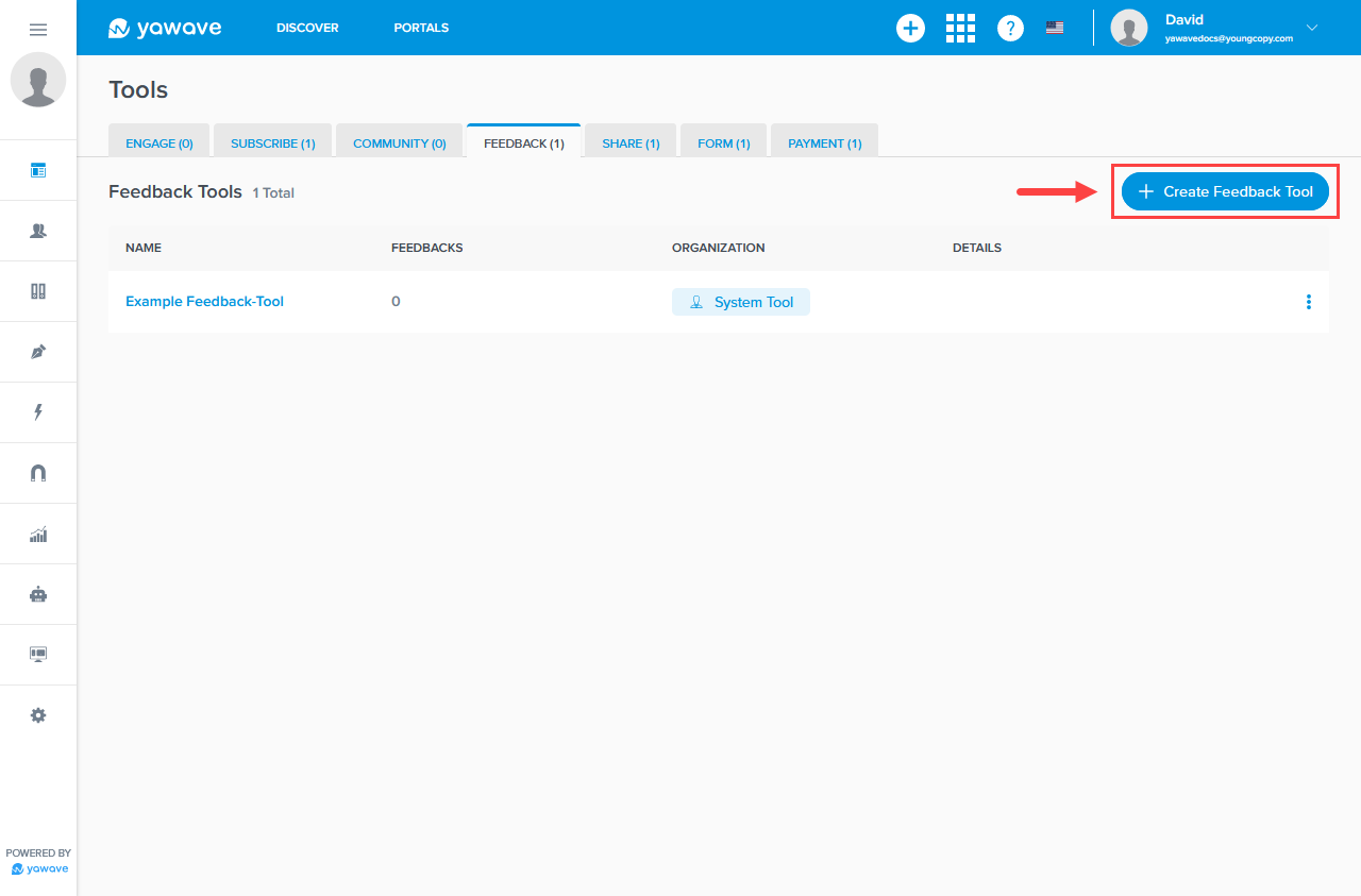
- Click Tools/Feedback Tools.
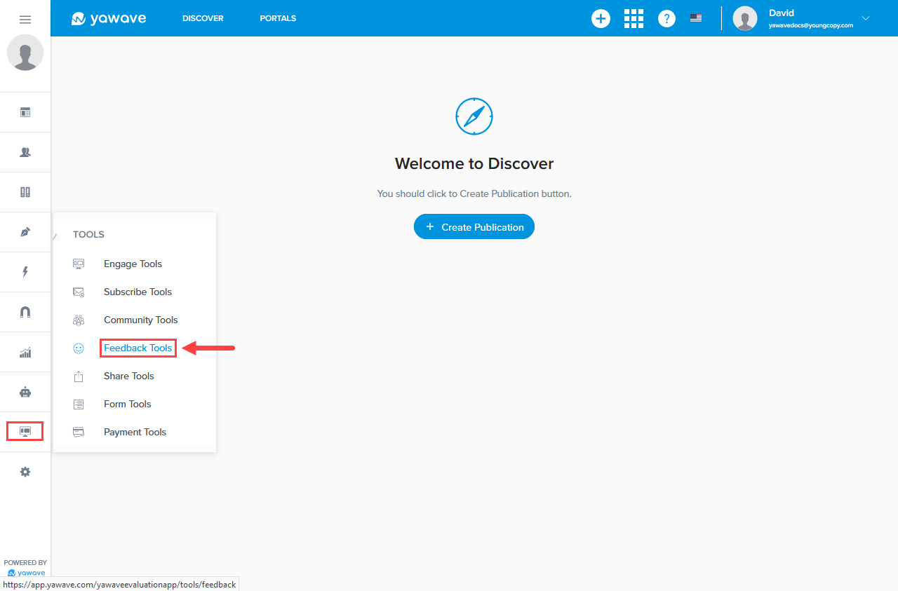
- Click Create Feedback Tool.
- Enter a name of your choosing in the Name field. Note: This field has a 80 character limit.
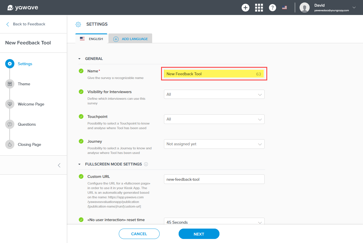
- The Feedback Tool offers two ways to restrict how users fill out the form:
- Interviewer (Manager, Member, Owner of the application) leads the interview
- Interviewee (the person being interviewed) answers questions
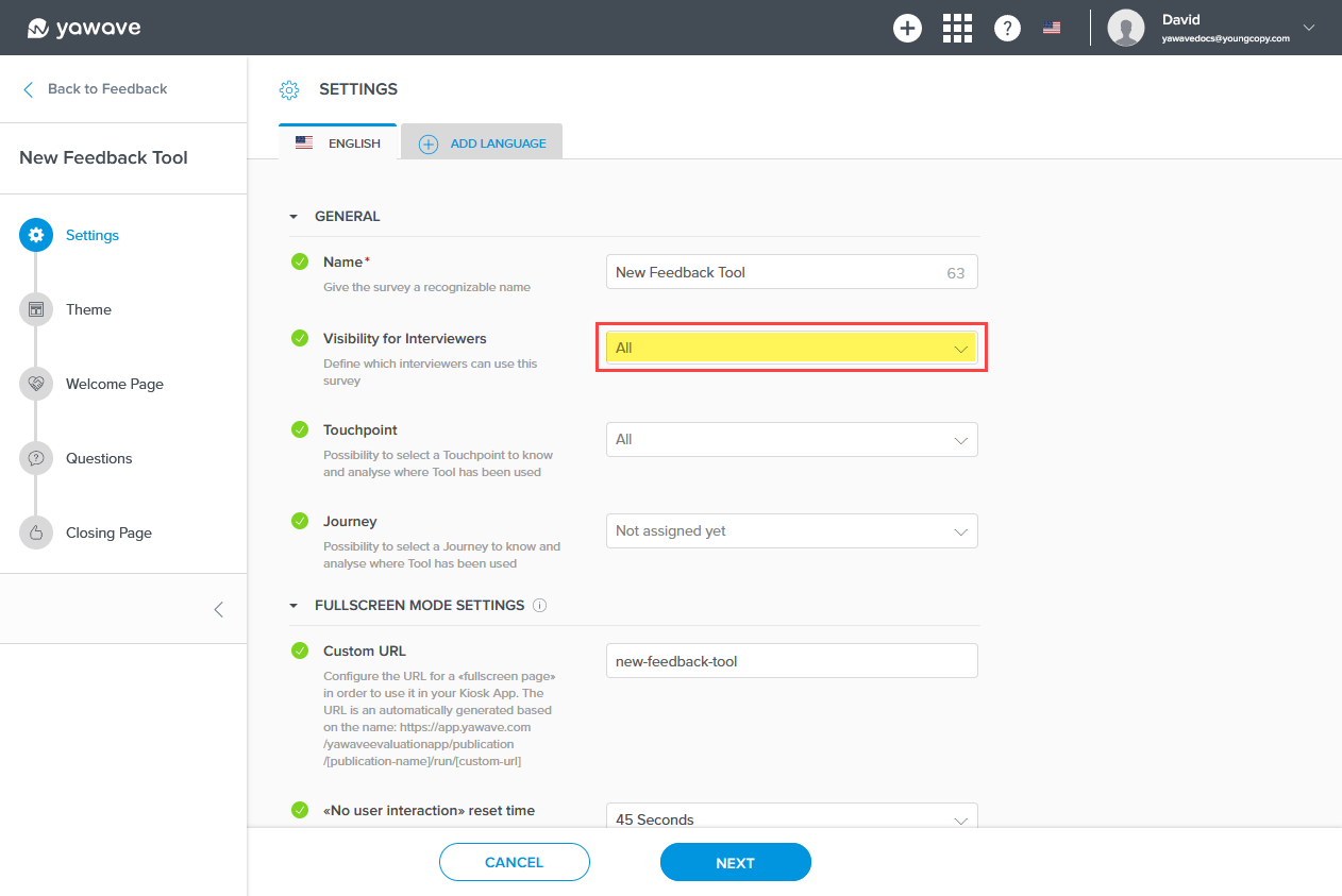
Select the interviewer types from the Visibility for Interviewers drop-down menu. Note: You can click more than one box next to the type of interviewer.
-
The Touchpoint and Journey settings are optional and require more advanced understanding of the Yawave product. If you are already familiar with these settings and how they work, complete the following, otherwise continue to Step 6.
- Select Add Touchpoint from the drop-down menu.
- Select a Journey from the drop-down menu or select Add Journey to create a new one.
Configure for iPad or kiosk (Full Screen Mode)
The next three settings (6, 7, 8) need to be configured if you plan to use the Feedback Tool on Full Screen Mode. You can leave these default and configure at a later time if needed. Skip to Step 9 if you do not plan to use the Feedback Tool on Full Screen Mode, iPad or kiosk. Note: You are not limited to using an iPad. You can use any brand of tablet or any size monitor.
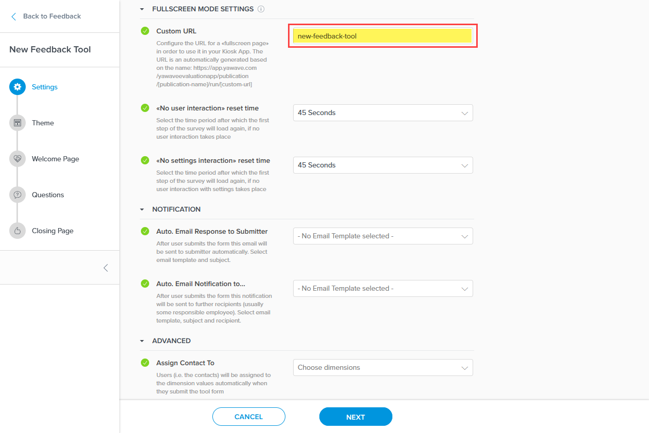
- Configure this setting if using fullscreen mode (on an iPad or kiosk). The Custom URL is the URL you'll use when your Feedback Tool is collecting information from users. This setting is part of a custom link used to show the Feedback Tool to users, both interviewers and interviewees). The name you enter will be appended to the custom link. Enter the name you want to use as part of the link in the Custom URL field. Note: Copy and save this value you enter in the Custom URL field to be used later.
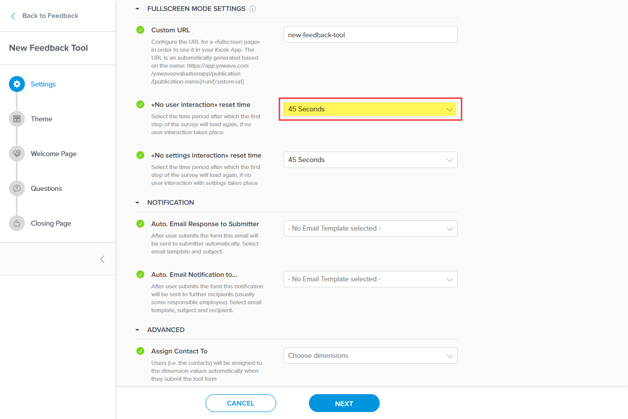
- Configure the <<No user interaction>> reset time setting if using fullscreen mode (on an iPad or kiosk). This setting is the time in seconds you want the Feedback Tool to reset after no activity. For example, if the Feedback Tool is not in use for the amount of time you selected, it will start over from the beginning. The default setting is 45 Seconds. You can select from 15 Seconds to 120 Seconds or select None if you do not want the Feedback Tool to start over from the beginning. Select the time in seconds from the <<No user interaction>> reset time drop-down menu.
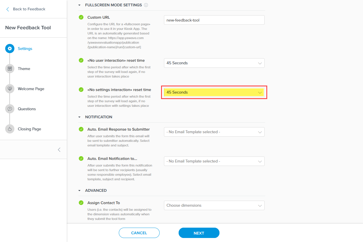
- Configure the <<No settings interaction>> reset time setting if using fullscreen mode (on an iPad or kiosk). This setting is the time in seconds you want the Feedback Tool to reset after no activity from a manager changing the Feedback Tool's settings. For example, if a manager is not changing a previously configured Feedback Tool's settings for the amount of time you selected, it will reset any changes the manager made to the Feedback Tool. The default setting is 45 Seconds. You can select from 15 Seconds to 120 Seconds or select None if you do not want the Feedback Tool to reset the manager's changes. Select the time in seconds from the <<No settings interaction>> reset time drop-down menu.
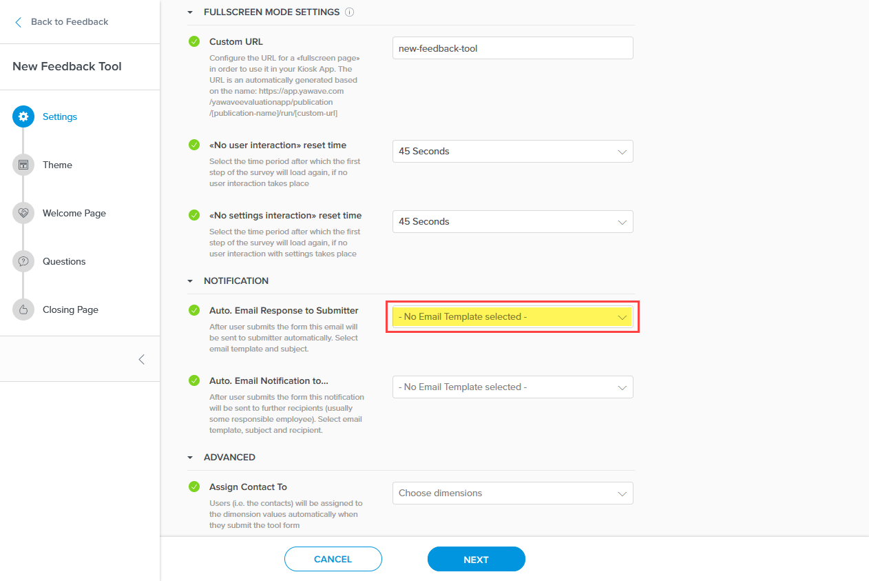
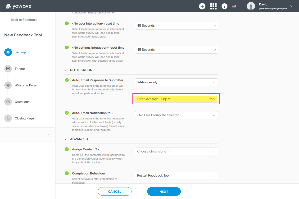
- The Auto. Email Response to Submitter setting requires an email template that Yawave sends to a user after they complete the questionnaire. Note: The template can be any name and have any content you want to use, but do note the template will be sent to the user after they complete the questionnaire. If you have not done so already, Create an Email Template. Once you have created your email template, start typing the name in the Auto. Email Response to Submitter field. Continue typing the name until your template appears. When your email template appears, click the email template from the drop-down menu. The Auto. Email Response to Submitter setting should show the email template selected.
If you have created an email template you want to use for the Auto. Email Response to Submitter email and it does not show up in the list, you'll need to refresh the page.
Next, enter a subject you want to include with the email every time it's sent to the user.
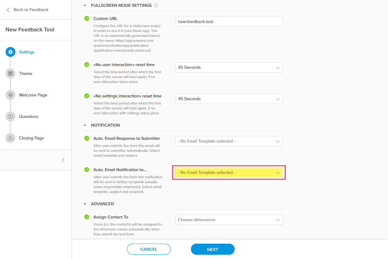
- The Auto. Email Notification to... setting is similar to the Auto. Email Response to Submitter setting in Step 9 above. The difference is the Auto. Email Notification to... email is sent to the person responsible for managing completed questionnaires. For example, the email will be sent to your Yawave administrator or anyone on your team who needs to have a record of who completed the questionnaire. The Auto. Email Notification to... setting requires an email template that Yawave sends to an administrator or someone keeping records after the user completes the questionnaire. Note: The template can be any name and have any content you want to use, but do note the template will be sent after the user completes the questionnaire. If you have not done so already, Create an Email Template. Once you have created your email template, start typing the name in the Auto. Email Notification to... field. Continue typing the name until your template appears. When your email template appears, click the email template from the drop-down menu. The Auto. Email Notification to... setting should show the email template you selected.
If you have created an email template you want to use for the Auto. Email Notification to... email and it does not show up in the list, you'll need to refresh the page.
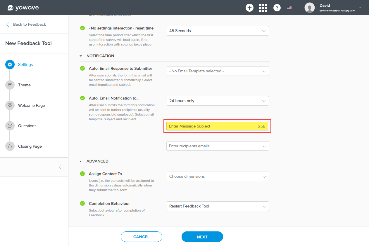
Next, enter a subject you want to include with the email every time it's sent to the person or people managing the completed questionnaires.
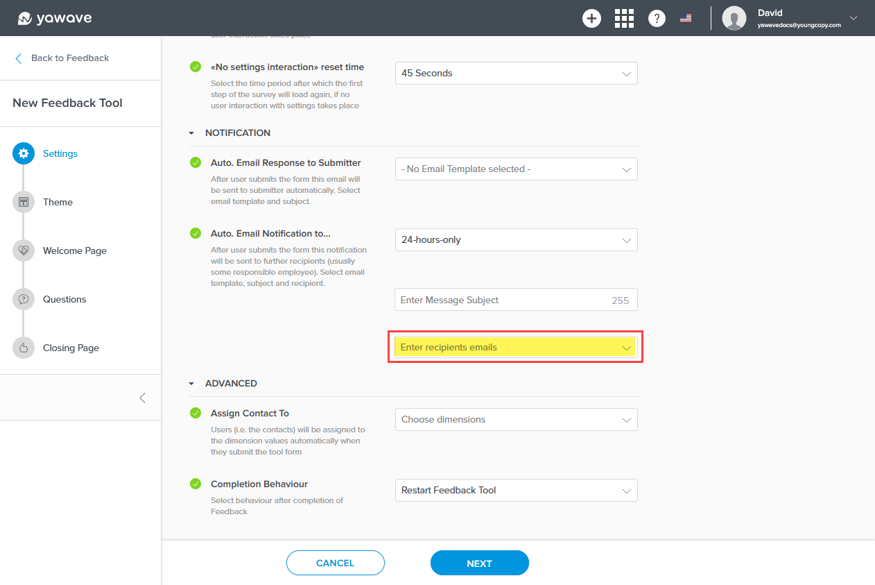
Enter the email address(es) of the recipient(s) you want to send the email to when a questionnaire is completed.
-
Assign Contact To is an advanced setting. Documentation coming soon.
-
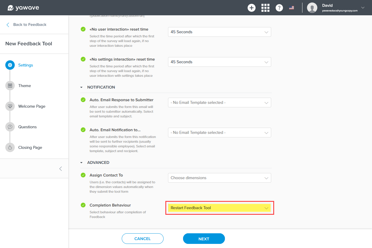
For the Completion Behaviour setting you have two options: restart the Feedback Tool from the beginning or redirect the user to a link you choose. Completion Behaviour shows Restart Feedback Tool as default. This means the Feedback Tool will start over once the user has completed the questionnaire.
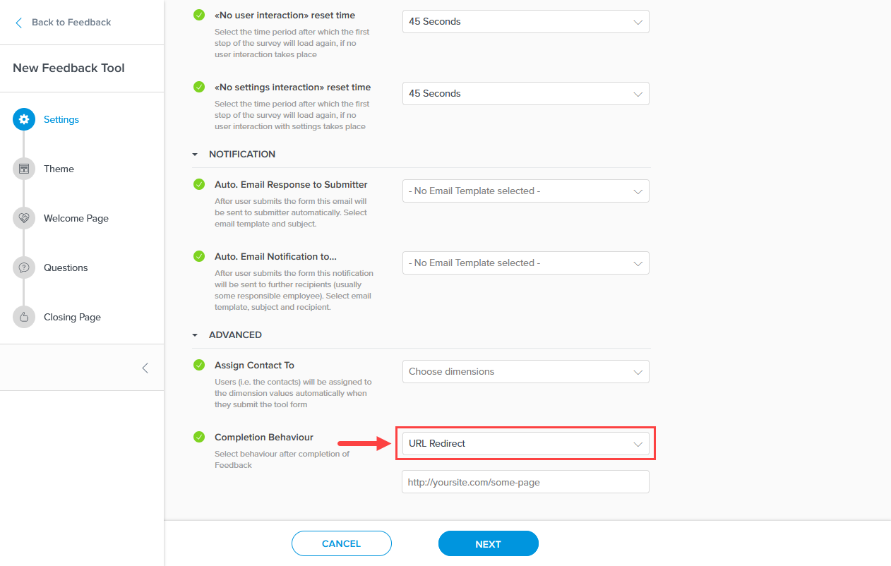
If you want to redirect the user to another page, link or URL, select URL Redirect from the drop-down menu and wait for the page to refresh.
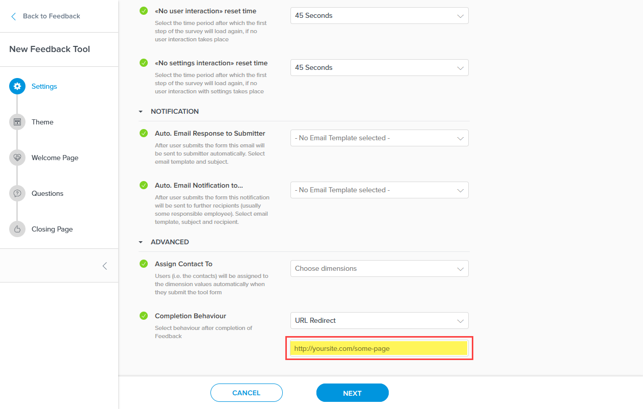
Once the page refreshes, add the link/URL to the page you want to redirect your user to in the text field.
- Click Next.
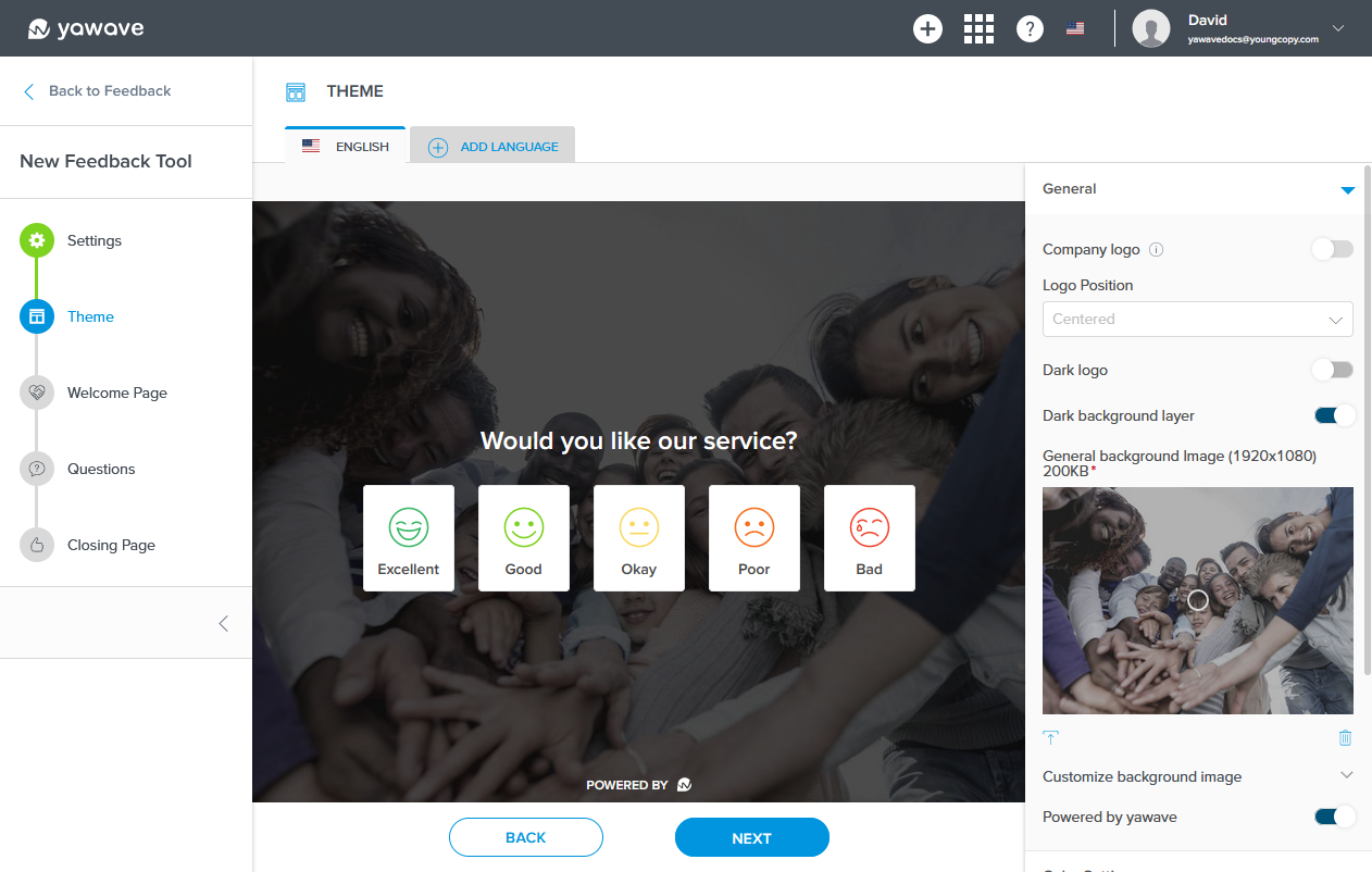
Customize Feedback Tool Theme
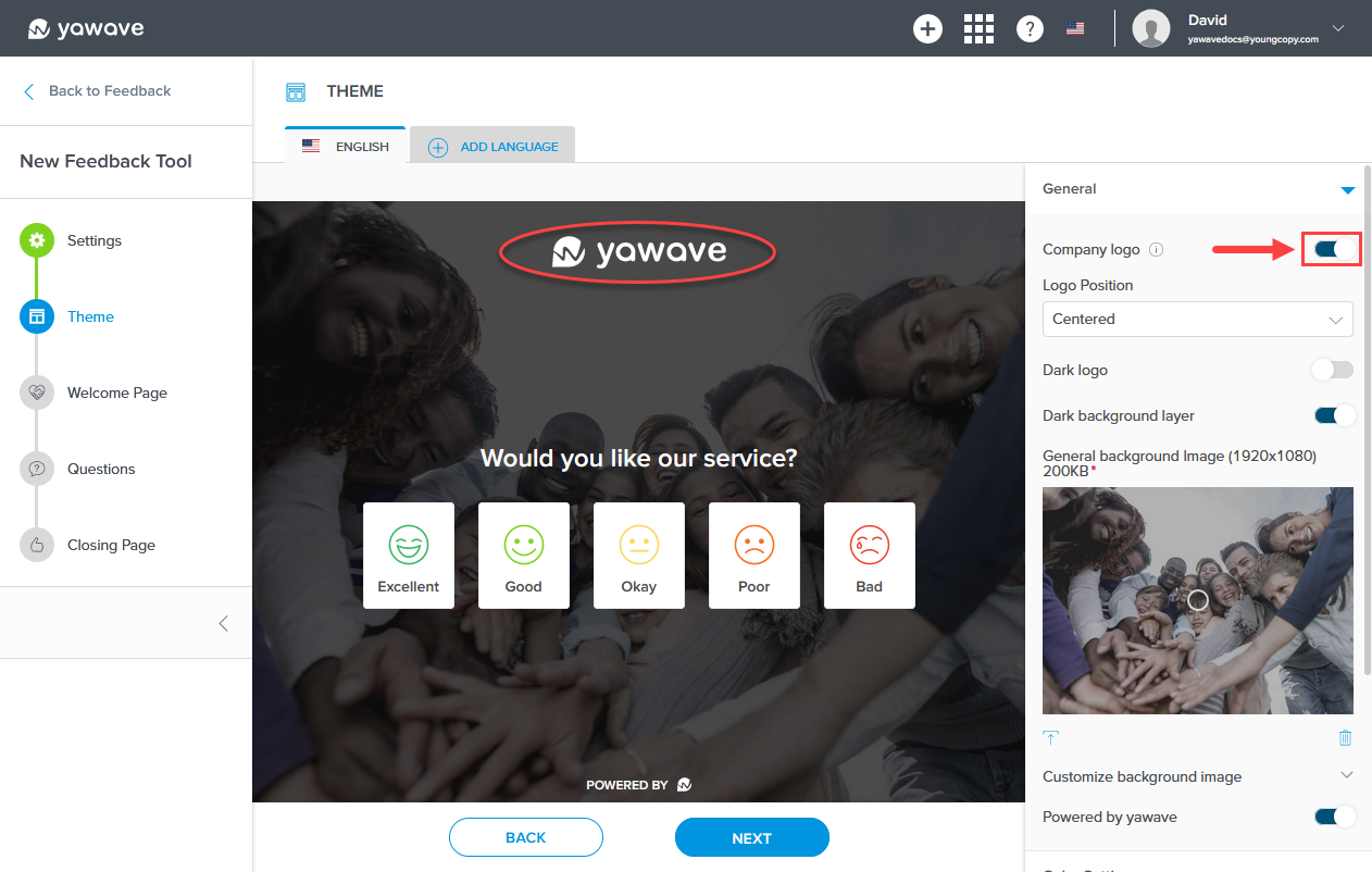
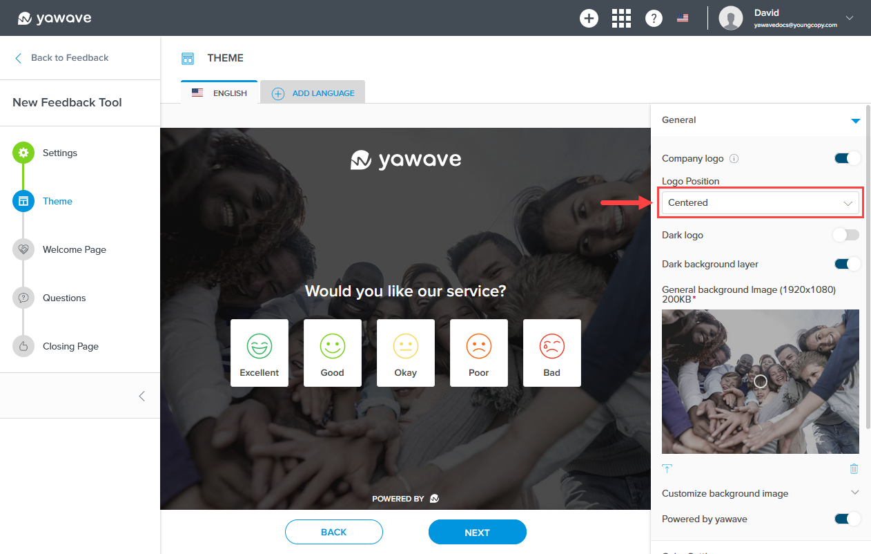
- By default Company Logo is enabled. If disabled, the logo (in this example, yawave) will not be shown. Click the toggle once to disable this feature. Note: The Company Logo is set when you Configure Branding.
When Company Logo is disabled, the Feedback Tool Theme company logo will be removed and look similar to the following image.
By default the Company Logo position is set to Centered as shown in the image above. Select the company logo position from the Logo Position drop-down menu. Choices include Centered, Right or Left.
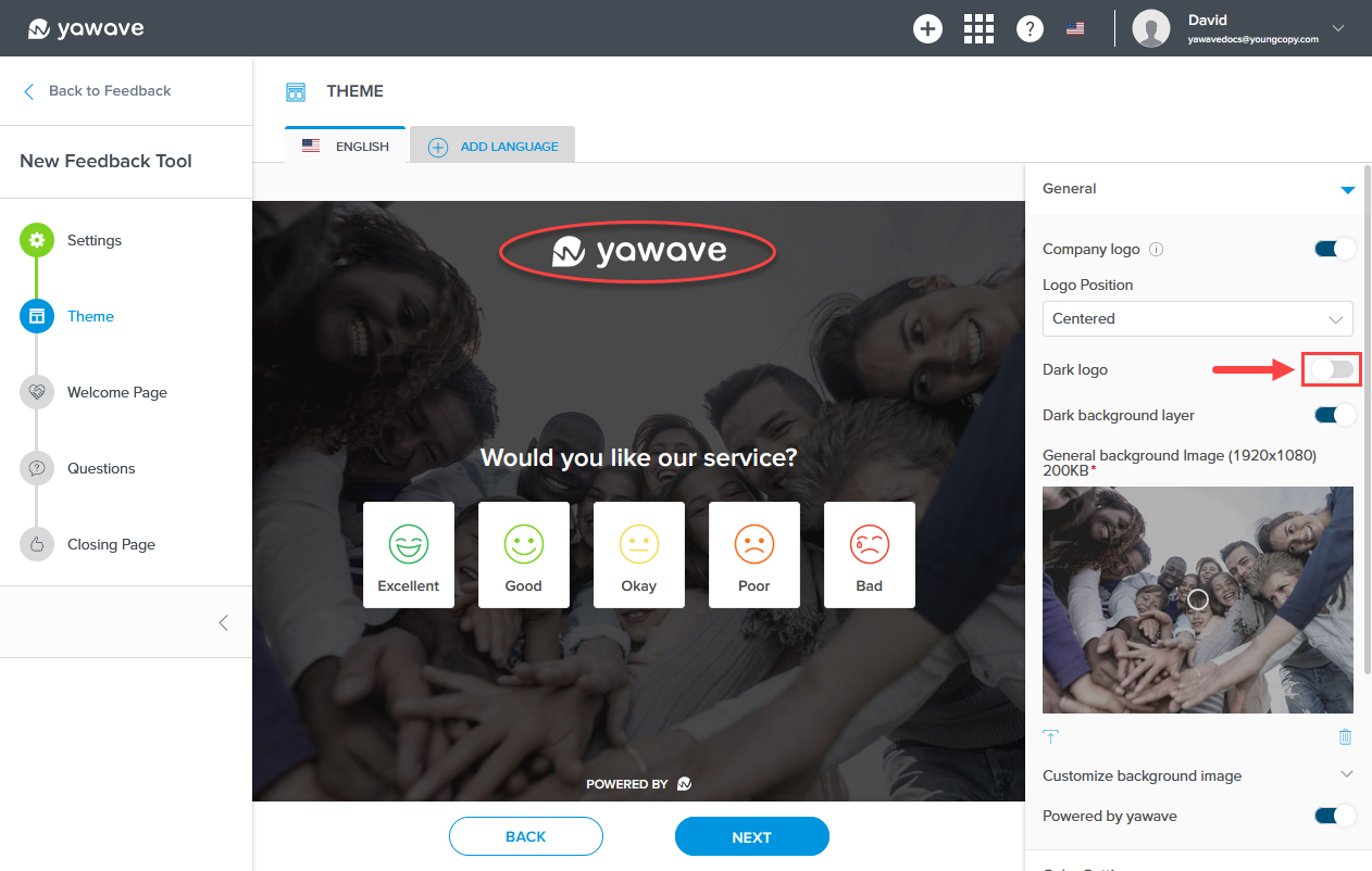
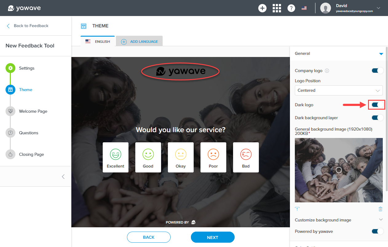
- By default Dark logo is disabled. If enabled, the white logo (in this example, yawave) will be shown as a dark logo. Click the toggle once to change the white logo to a dark logo. Note: This applies to the logo in Step 14 above.
When Dark logo is enabled, the Feedback Tool Theme company logo will look similar to the following image.
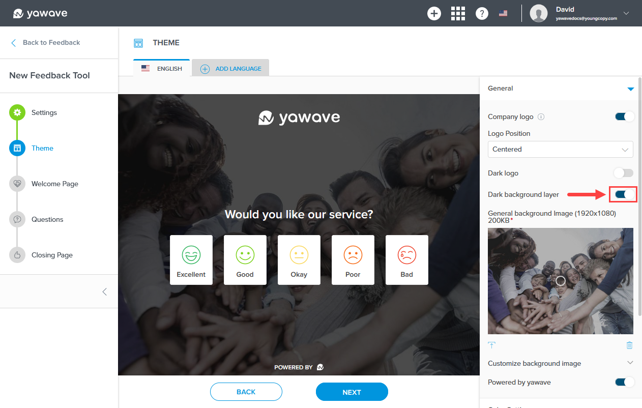
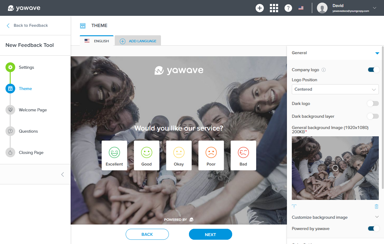
- By default Dark background layer is enabled. If disabled, the image background color (in this example, blue) will not be shown. Click the toggle once to disable this feature.
When Dark background layer is disabled, the Feedback Tool Theme background will look similar to the following image.
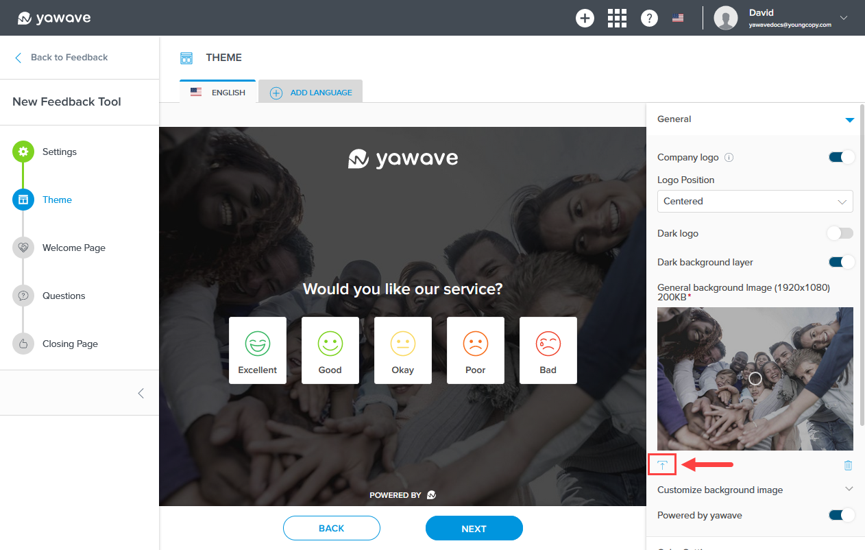
- Click the upload icon below the General background Image to select a new image for the Feedback Tool Theme background.
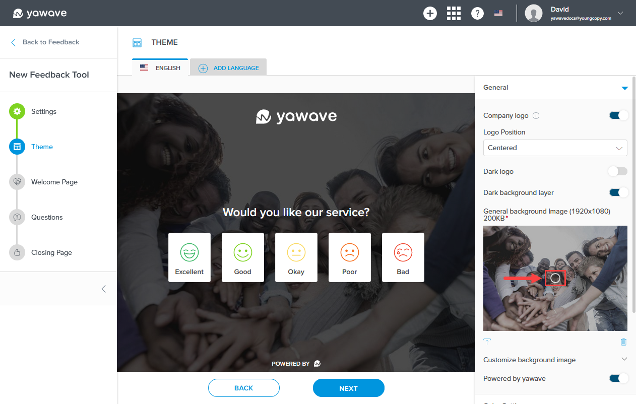
Click and drag the circle icon in the General background Image to change the image's focal point.
- By default Powered by yawave is enabled. If disabled, the image will not be shown. Click the toggle once to disable this feature.
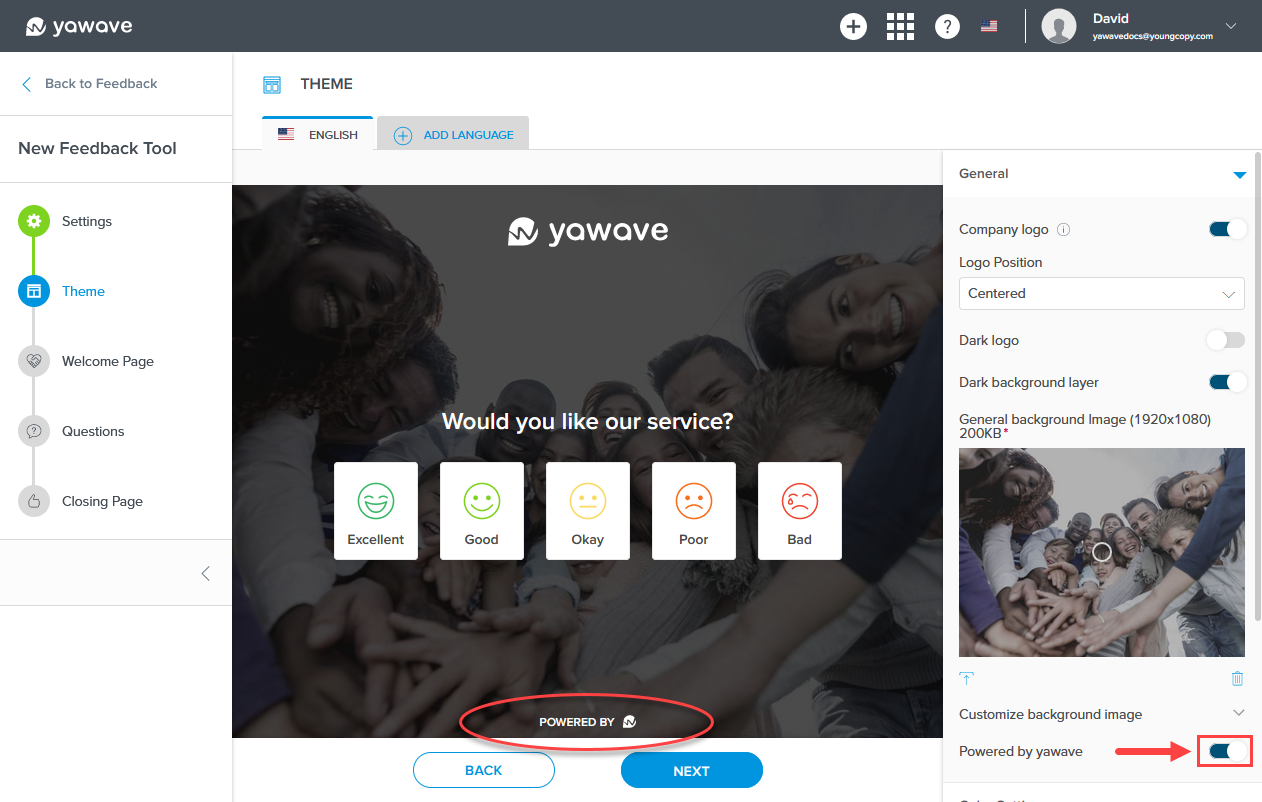
When Powered by yawave is disabled, the Feedback Tool Theme Powered by Yawave logo will be removed and look similar to the following image.

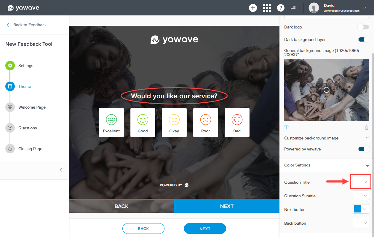
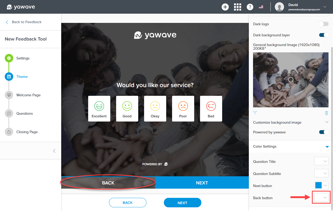
- Next you'll need to configure the colors for the Question Title, Question Subtitle, Next button and Back button.
Select the color you want to use for the Question Title from the Question Title drop-down menu. Here you can enter a Hex value, RGB value or use the color picker.
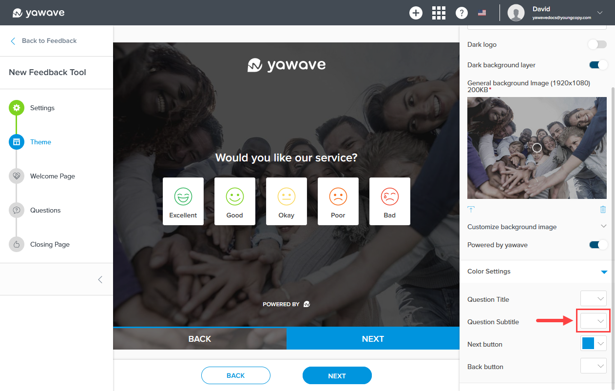
Select the color you want to use for the Question Subtitle from the Question Subtitle drop-down menu. Here you can enter a Hex value, RGB value or use the color picker. Helpful Tip: As you continue to read through the following instructions you'll see an example of the Question Subtitle when you configure the Welcome Page. Note the Question Subtitle will be shown under the Question Title.
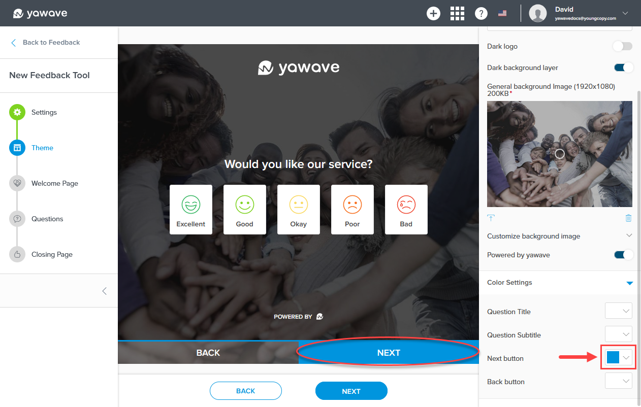
Select the color you want to use for the Next button from the Next button drop-down menu. Here you can enter a Hex value, RGB value or use the color picker.
Select the color you want to use for the Back button from the Back button drop-down menu. Here you can enter a Hex value, RGB value or use the color picker.
- Click Next.
Configure Feedback Tool Welcome Page
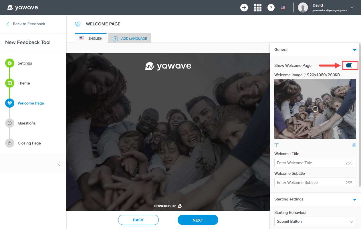
- The Feedback Tool Welcome Page is the first screen your end users will see when viewing your questionnaire. By default Show Welcome Page is enabled. If disabled, the Feedback Tool Welcome Page will not be shown. If you do not want the Feedback Tool Welcome Page to be shown, click the toggle once to disable this feature. If you disable the Welcome Page, you will not be able to configure settings for this screen.
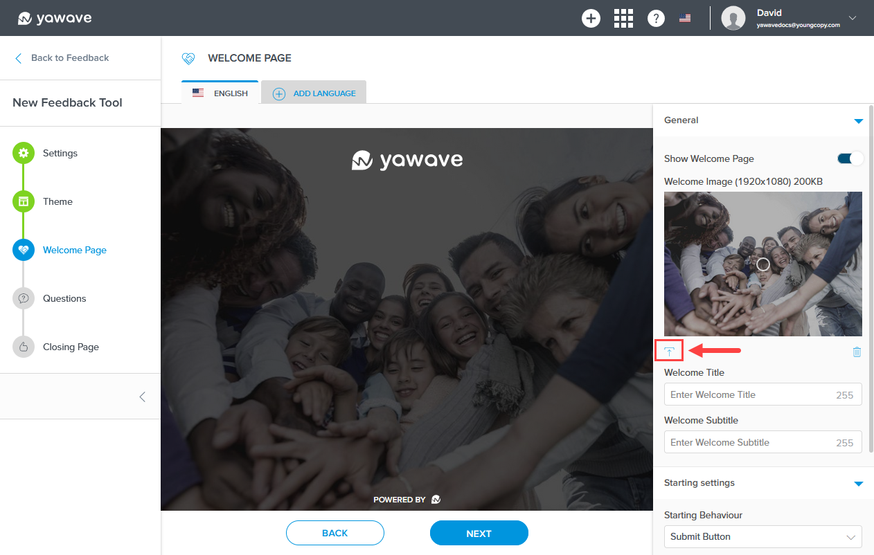
- Click the upload icon below the Welcome Image to select a new image for the Feedback Tool Welcome Page background. Note: This image only appears on the Welcome Page.
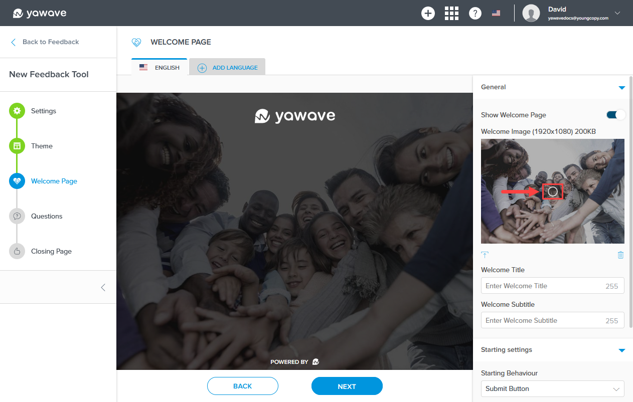
Click and drag the circle icon in the Welcome Image to change the image's focal point.
- Enter a title of your choosing in the Welcome Title field (A). What you enter as the Welcome Title will be shown on the Feedback Tool Welcome Page (B). Note: This field has a 255 character limit.
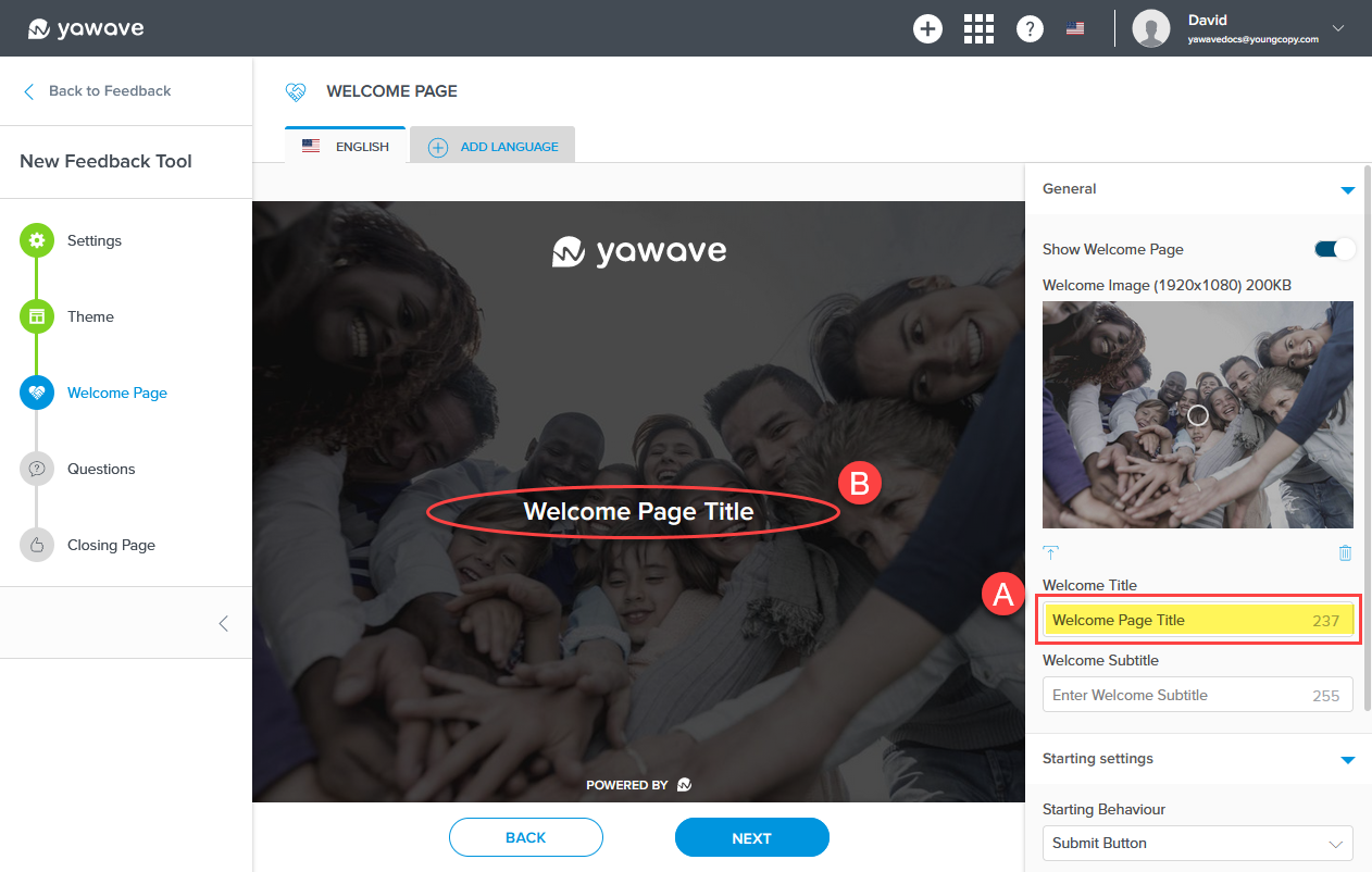
- Enter a subtitle of your choosing in the Welcome Subtitle field (A). What you enter as the Welcome Subtitle will be shown in the Feedback Tool Welcome Page (B). Note: This field has a 255 character limit.

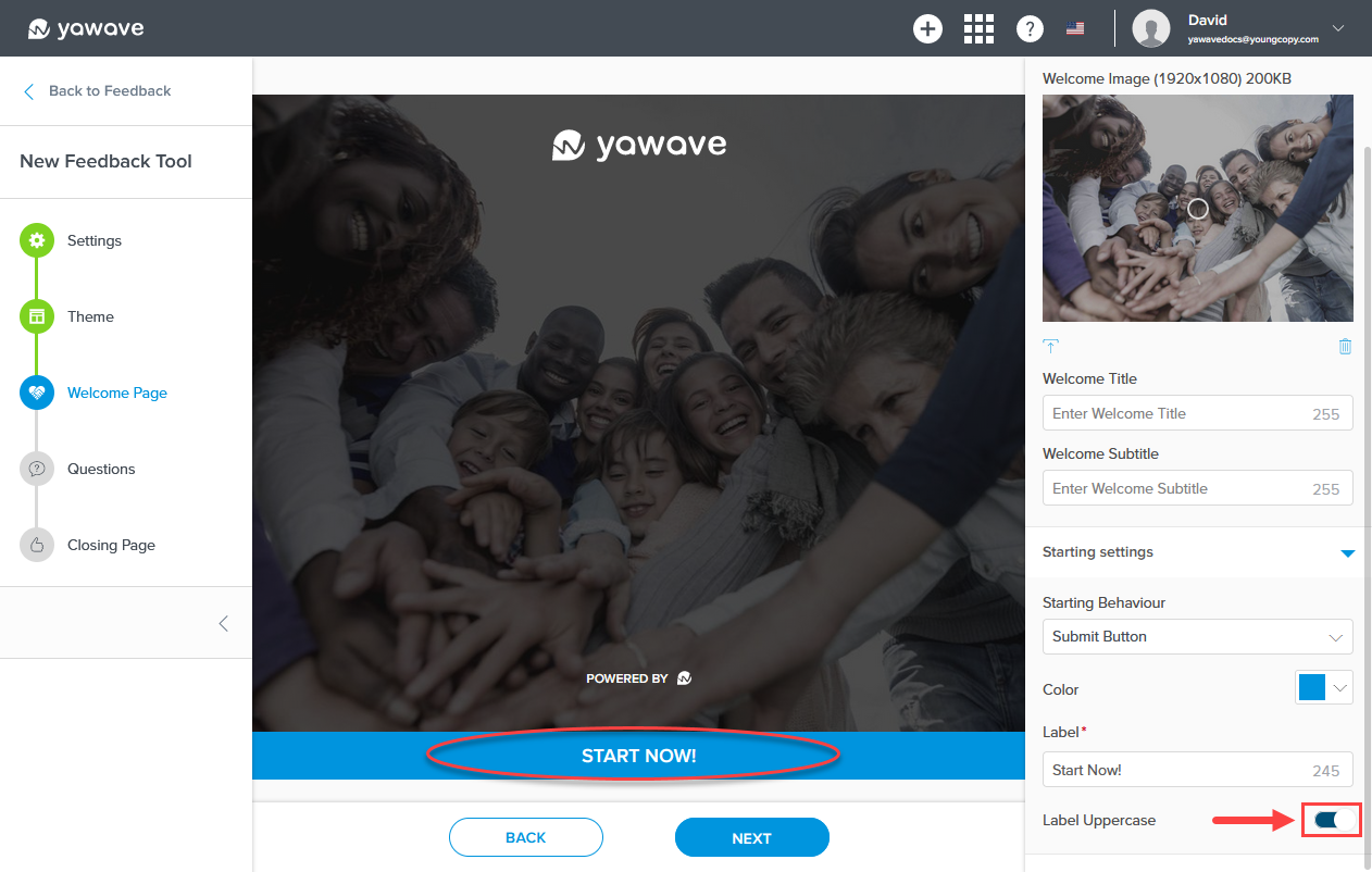
- Next you'll need to configure the Starting settings. By default the Submit Button is selected as the Starting Behavior. Leave as the default Submit Button as shown below or continue reading for the option to start the questionnaire by selecting a language.
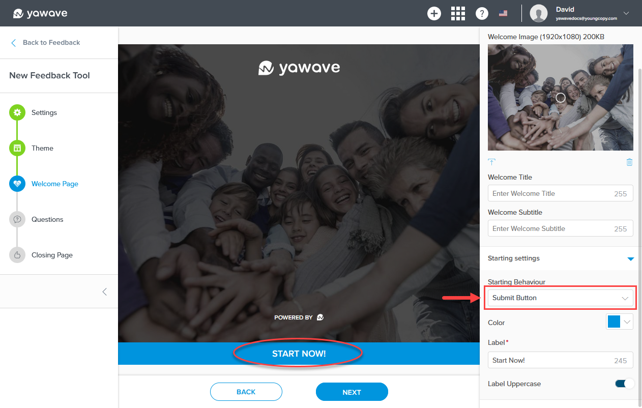
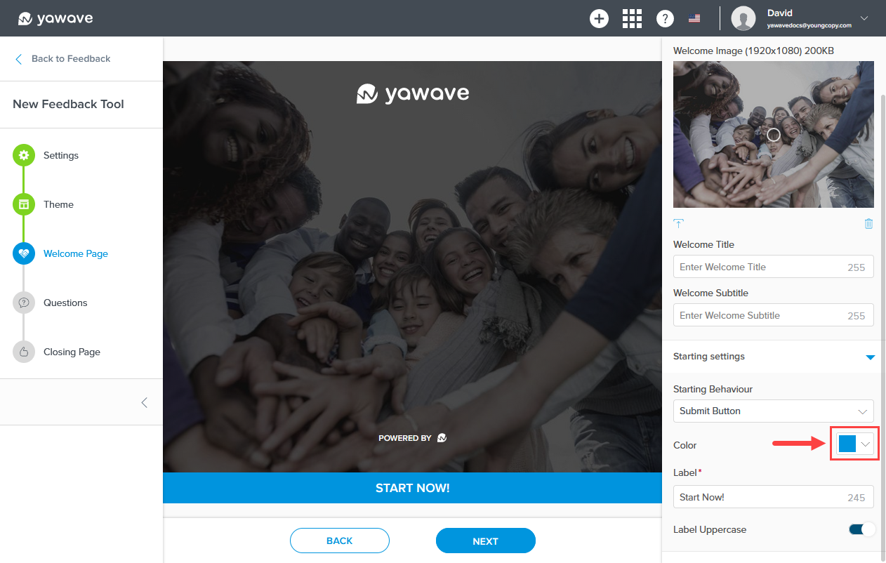
Select the color you want to use for the Submit Button from the Color drop-down menu. Here you can enter a Hex value, RGB value or use the color picker.
Enter the name you want to use for the Welcome Page Submit Button (B) in the Label field (A). Note: This field has a 255 character limit.
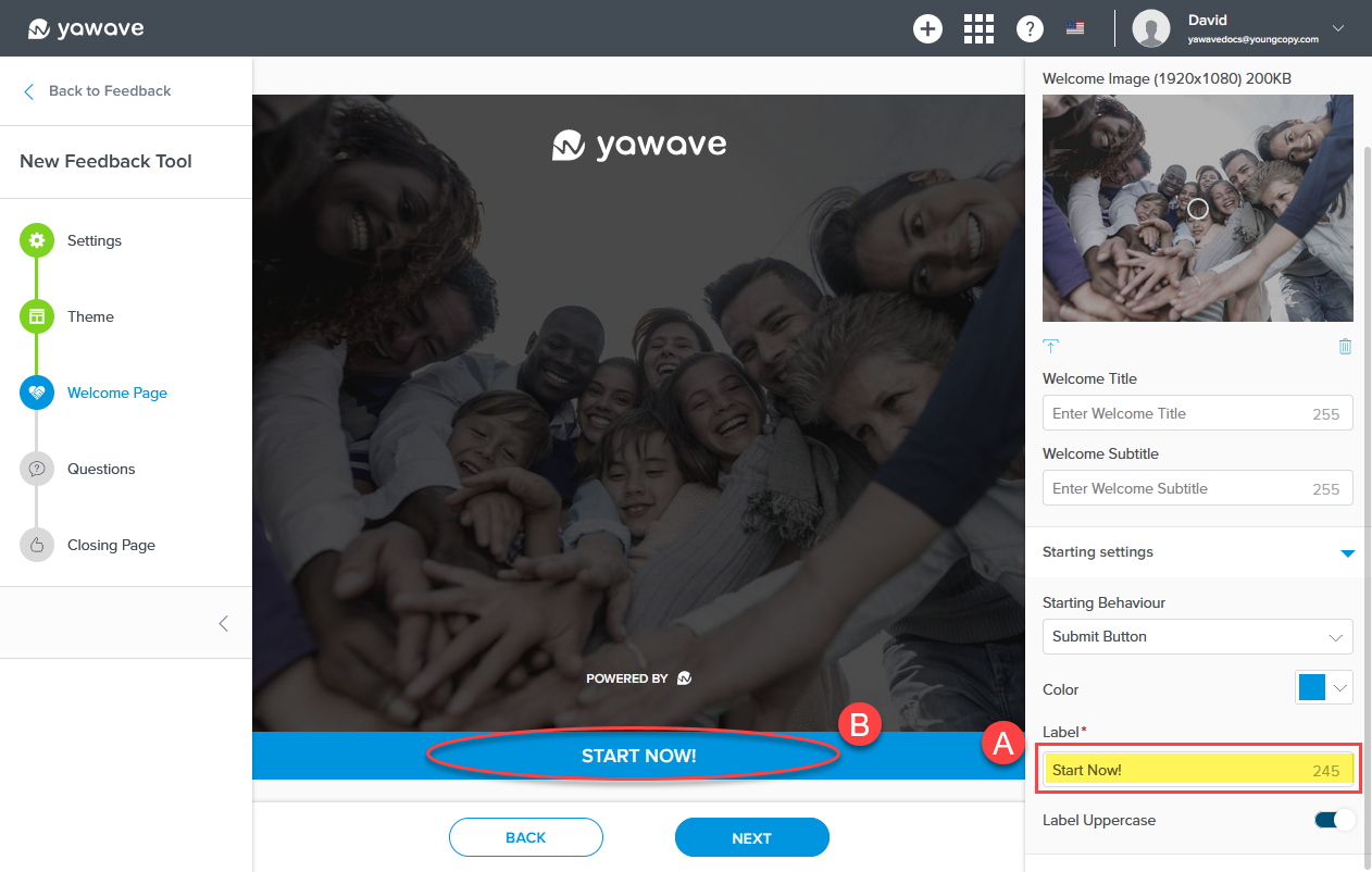
The Label Uppercase setting changes the Submit Button label to lowercase or uppercase. When the Label Uppercase toggle is enabled (the default setting), the Submit Button label will be shown as uppercase. When the Label Uppercase toggle is disabled, the Submit Button label will be shown as lowercase. To show the Submit Button label as lowercase, click the Label Uppercase toggle once.
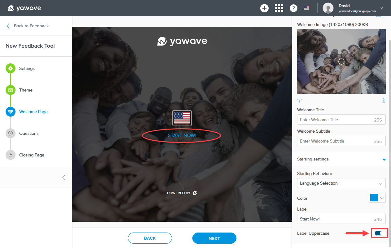
The alternative is to select Language Selection from the Starting Behaviour drop-down menu as shown in the image below. Notice the START NOW! text link below the flag. Note: The flag corresponds with the language you select when using Yawave. The language you use in Yawave can be changed anytime by Option 1: Clicking the language's corresponding flag in the top menu or Option 2: Go to Profile/Account Settings and select your Language / Timezone.
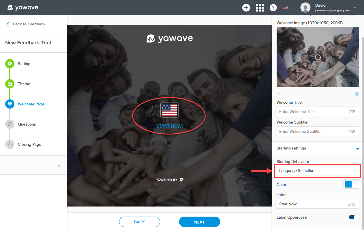
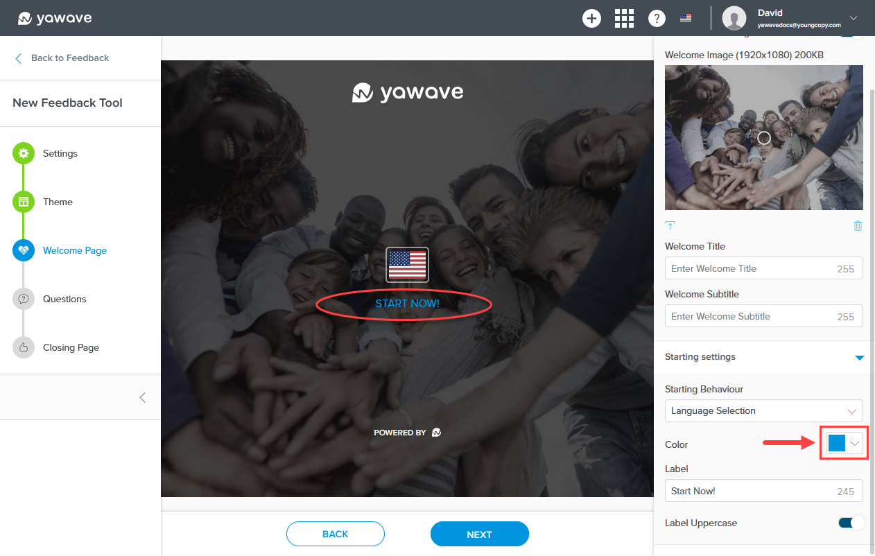
Select the color you want to use for the Language Selection label from the Color drop-down menu. Here you can enter a Hex value, RGB value or use the color picker.
Enter the name you want to use for the Welcome Page Start Now! label (B) in the Label field (A). Note: This field has a 255 character limit.
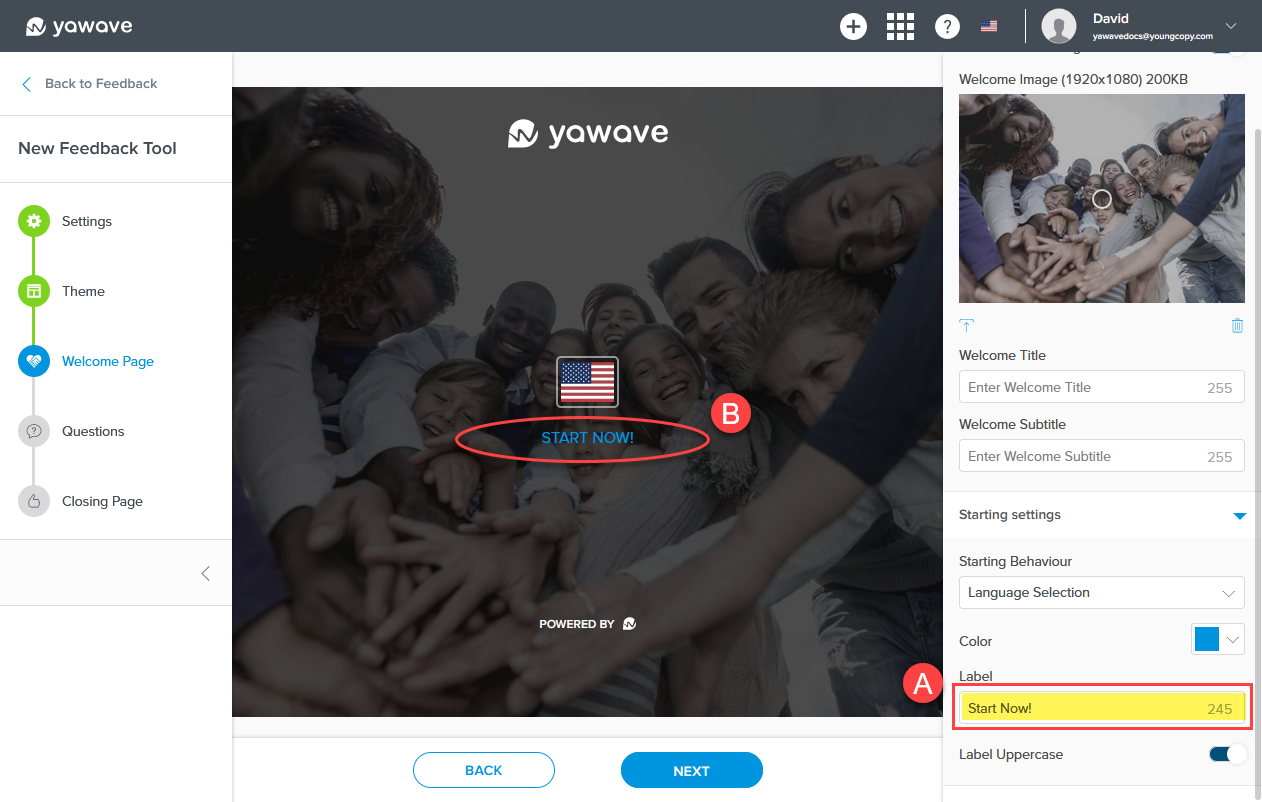
The Label Uppercase setting changes the Start Now! label to lowercase or uppercase. When the Label Uppercase toggle is enabled (the default setting), the Start Now! label will be shown as uppercase. When the Label Uppercase toggle is disabled, the Start Now! label will be shown as lowercase. To show the Start Now! label as lowercase, click the Label Uppercase toggle once.
- Click Next.
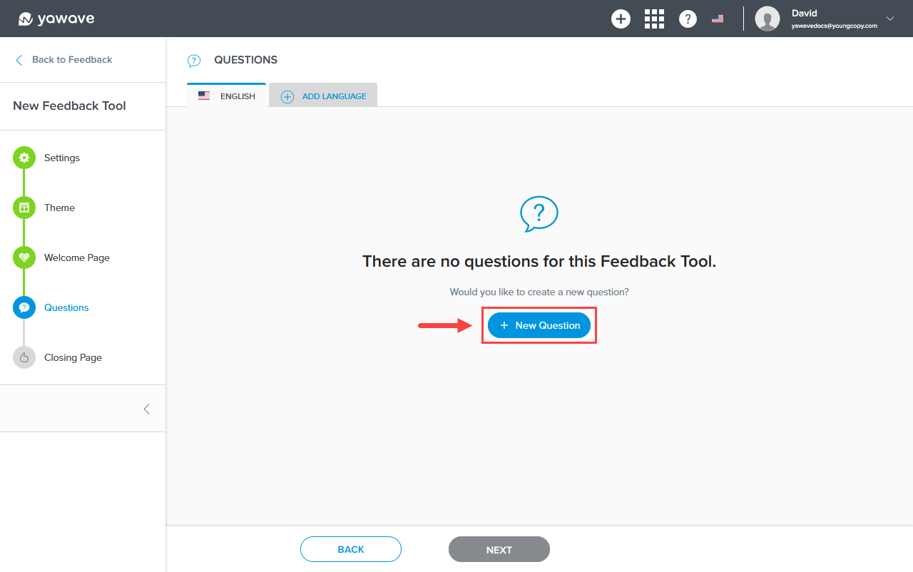
Create and Add Questions
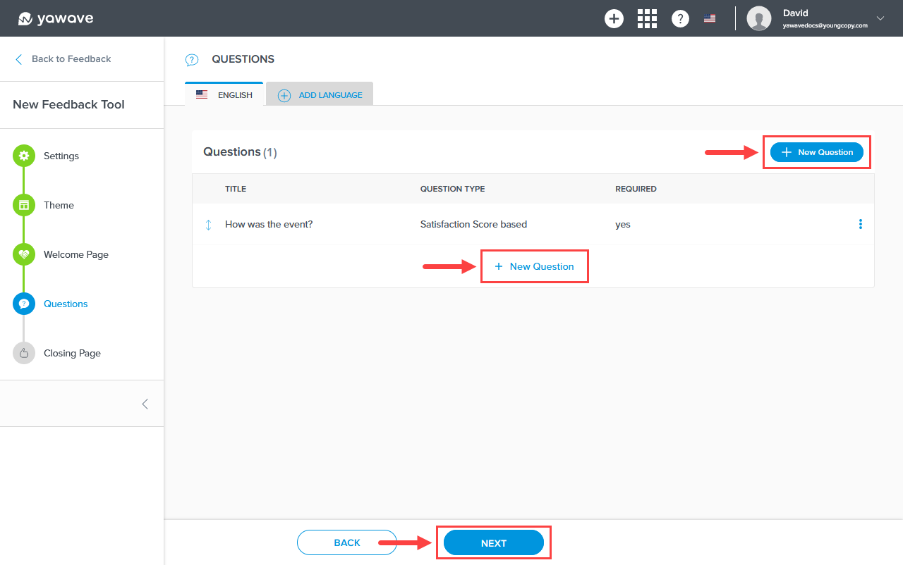
- Click New Question.
- Click the upload icon below the Background Image to select a new image for the Feedback Tool Question background.
Click and drag the circle icon in the Background Image to change the image's focal point.
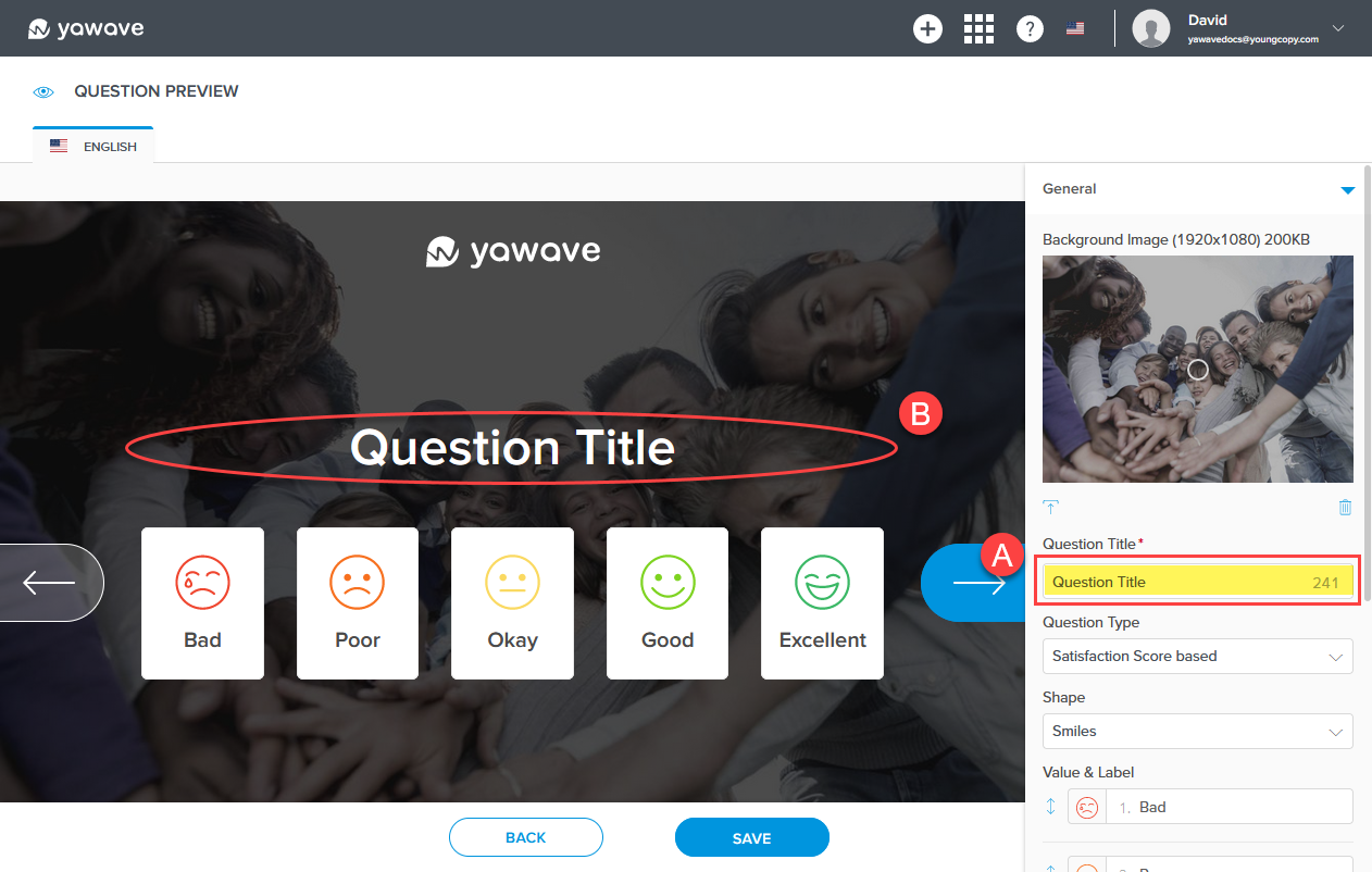
- Enter your first question in the Question Title field (A). What you enter as the Question Title will be shown on the Feedback Tool Questions page (B). Note: This field has a 255 character limit.
- Select the question format you want to use for your questionnaire from the Question Type drop-down menu.
Your choices include the following:
- Satisfaction Score based uses five icons and comes in three shapes (Smiles, Stars and Hearts). You can change the label and move the order of each icon.
- Text based allows users to type answers or enter text answers.
- Net Promoted Score based uses a value system of 1-10.
- Value range based uses a label and corresponding value.
Create a Satisfaction Score based question
By default the Satisfaction Score based Question Type is selected.

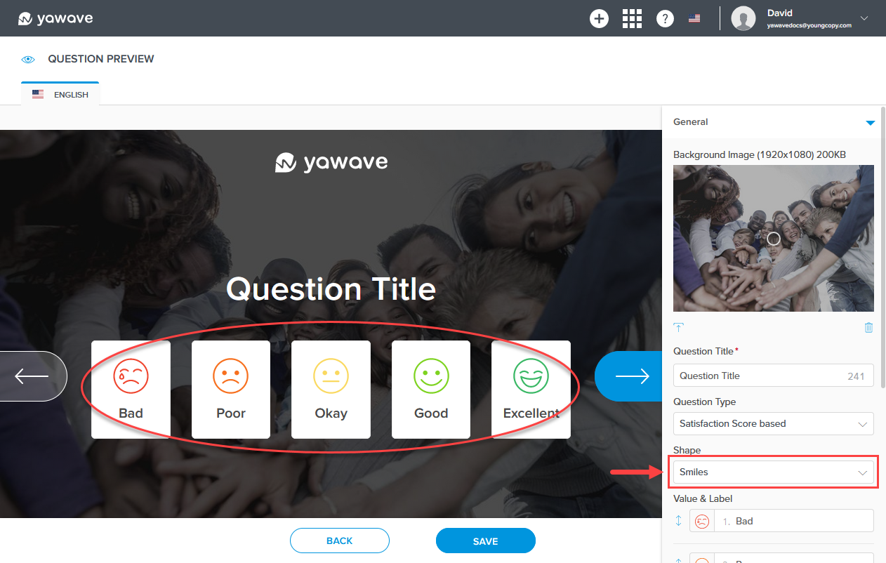
Select one of the three shapes (Smiles, Stars and Hearts) you want to use from the Shape drop-down menu. By default the Smiles shape is selected.
Leave the default value or enter the value you want for each icon in the Value & Label field.
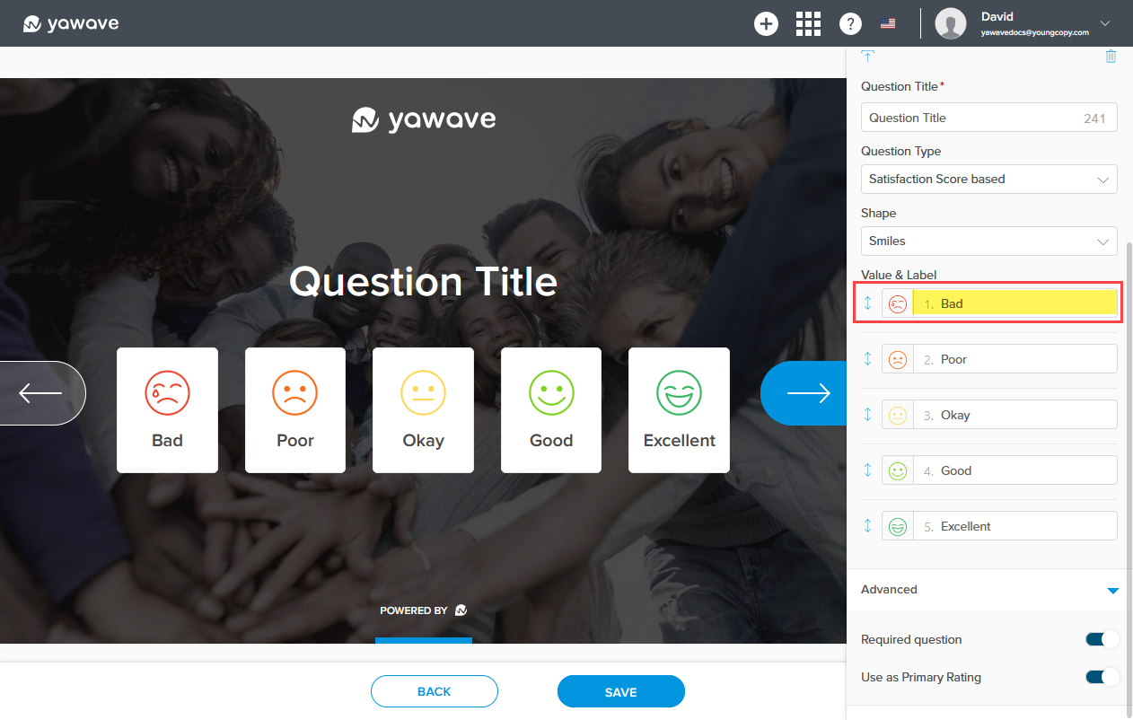
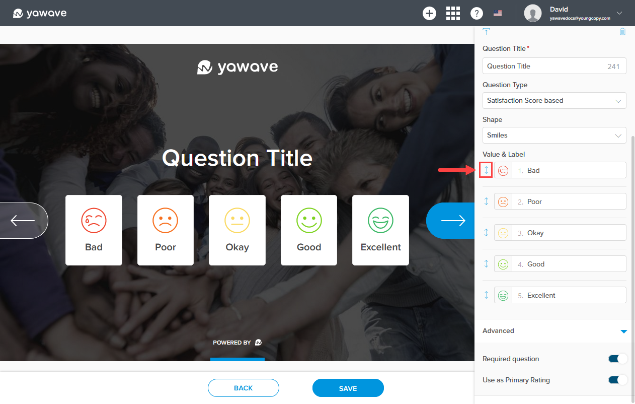
Click and drag the double arrow to the left of the value and label to move the icon up or down (this moves the icon to the left or right.
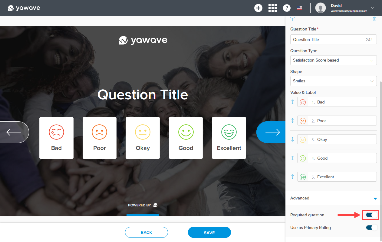
Questions are required by default. If a question is required, users cannot click or continue to the next question. If you do not want the question to be required, click the Required question toggle once to disable.
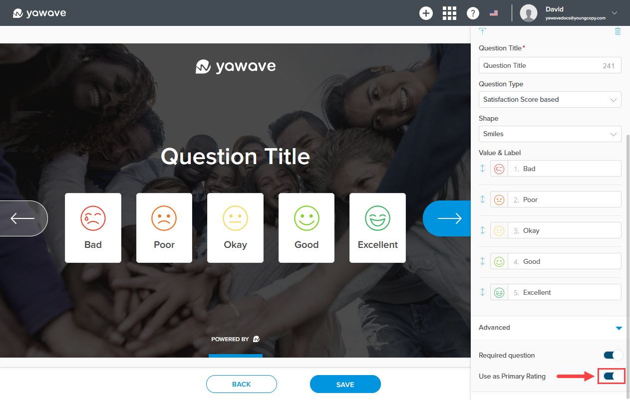
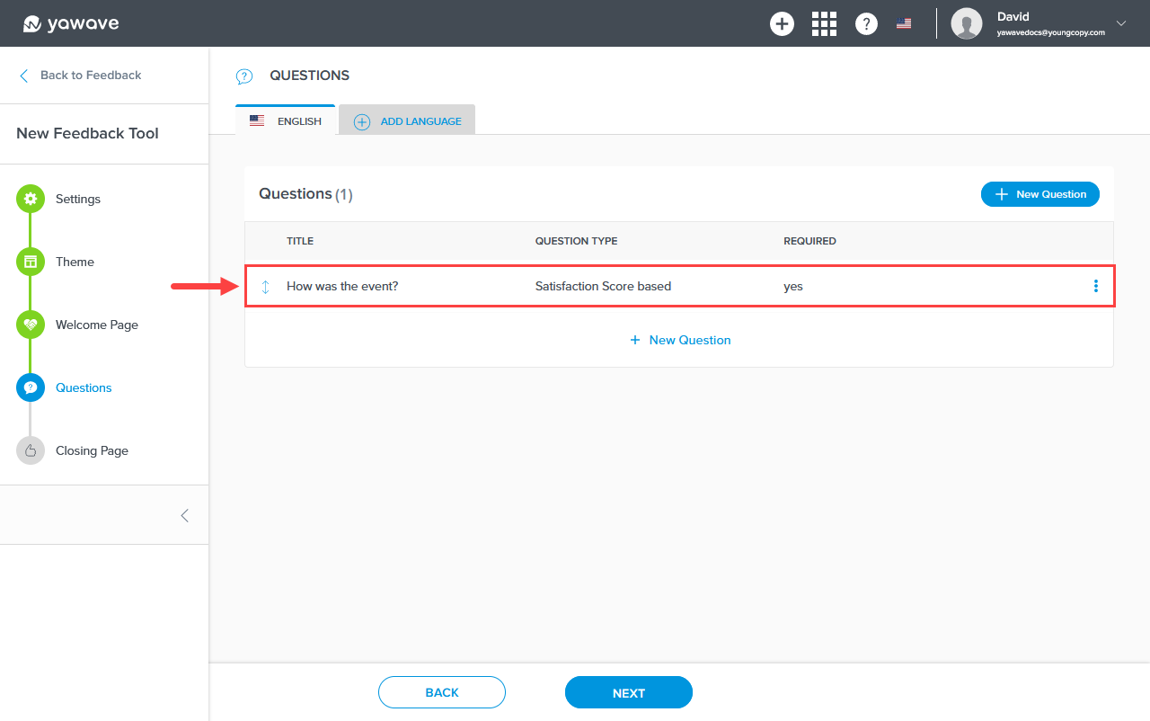
By default the Use as Primary Rating toggle is turned On. Use as Primary Rating can only be used for one question and will be shown in the Primary Score column in Engage/Feedbacks. For example, a Use as Primary Rating question can be "How was the event?" Note: Documentation coming soon on how to use data collected in Feedbacks.
Click Save. When the page loads you'll see the first question listed.
Here you can click New Question to add another question or click Next to configure the Closing Page (the last screen shown to the user in the questionnaire). Click here to skip to the instructions on how to configure the Closing Page.
Create a Text based question
Let's continue with creating a Text based question. Click New Question.
Enter the question you want to ask in the Question Title field.
Select Text based as the Question Type.
Enter the instructions (keep it simple) in the Question Title Label.
Questions are required by default. If a question is required, users cannot click or continue to the next question. If you do not want the question to be required, click the Required question toggle once to disable.
By default the Use as Primary text toggle is turned On. Use as Primary text can only be used for one question and will be shown in the Primary Text column in Engage/Feedbacks. For example, a Use as Primary text question can be "What did you like most about the event?" and the interviewee would have the option to fill out a text field.
Use as Responder Email is enabled by default. When enabled, the question field changes to an email address field. For example, you can ask "May we collect your email address?" as the Question Type and Please enter your email address here as the Question Type Label. If you do not want the question to collect the user's email address, click the Use as Responder Email toggle once to disable.
Here you can click New Question to add another question or click Next to configure the Closing Page (the last screen shown to the user in the questionnaire). Click here to skip to the instructions on how to configure the Closing Page.
Create a Net Promoted Score based question
Let's continue with creating a Net Promoted Score based question. Click New Question.
Enter the question you want to ask in the Question Title field.
Select Net Promoted Score based as the Question Type.
Questions are required by default. If a question is required, users cannot click or continue to the next question. If you do not want the question to be required, click the Required question toggle once to disable.
By default the Use as Primary Rating toggle is turned On. Use as Primary Rating can only be used for one question and will be shown in the Primary Score column in Engage/Feedbacks. For example, a Use as Primary Rating question can be "How was the event?" Note: Documentation coming soon on how to use data collected in Feedbacks.
Here you can click New Question to add another question or click Next to configure the Closing Page (the last screen shown to the user in the questionnaire). Click here to skip to the instructions on how to configure the Closing Page.
Create a Value range based question
Let's continue with creating a Value range based question. Click New Question.
Enter the question you want to ask in the Question Title field.
Select Value range based as the Question Type.
Enter the first value you want to use as the answer in the default Value label field.
Click Add Value to add another value to the list of answers. Continue with this step until all the values you want for answers have been added.
Questions are required by default. If a question is required, users cannot click or continue to the next question. If you do not want the question to be required, click the Required question toggle once to disable.
By default the Allow multiple answers toggle is turned On. Allow multiple answers allows users to select multiple answers. If you only want one answer for the question, click the Allow multiple answers toggle once to disable.
Here you can click New Question to add another question or click Next to configure the Closing Page (the last screen shown to the user in the questionnaire). Click here to skip to the instructions on how to configure the Closing Page.
Configure the Feedback Tool Closing Page
-
Drag and drop the image you want to use in the Closing Page page Background Image box or click the Background Image box to upload the new image.
-
Click the upload icon below the Closing Shape to select a new image for the Feedback Tool Closing Page background.
Click and drag the circle icon in the Closing Shape to change the image's focal point.
-
Enter a title of your choosing in the Closing Title field (A). What you enter as the Closing Title will be shown on the Feedback Tool Closing Page (B). Note: This field has a 255 character limit.
-
Enter a title of your choosing in the Closing Subtitle field (A). What you enter as the Closing Subtitle will be shown on the Feedback Tool Closing Page (B). Note: This field has a 255 character limit.
-
Optional Setting: By default the Closing Button toggle is disabled. When the Closing Button is enabled, users will see a button on the Closing Page. The button is clickable and will direct the user to the page you specificy. To enable, click the Closing Button toggle once and follow the steps below. Note: If the Closing Button is not enabled, the screen will automatically start over from the beginning.
a. If the Closing Button toggle is enabled, select the color you want to use for the Closing Button from the Color drop-down menu. Here you can enter a Hex value, RGB value or use the color picker.
b. The Label Uppercase setting changes the Closing Button label to lowercase or uppercase. When the Label Uppercase toggle is enabled (the default setting), the Closing Button label will be shown as uppercase. When the Label Uppercase toggle is disabled, the Closing Button label will be shown as lowercase. To show the Closing Button label as lowercase, click the Label Uppercase toggle once.
c. Enter the link/URL to the page you want to redirect your user to in the Link field. This is the link/URL the user will be redirected to when a user clicks the Closing Button.
-
Click Save.
-
Now that you have configured your Feedback Tool you should see your new Feedback Tool in the Feedback Tools list. Click your new Feedback Tool and go through the screens (the Feedback Tool will appear as a pop-up). If any adjustments need to be made, click the x at the top-right of the pop-up, then click the pencil icon located on the right side of the new Feedback Tool row. Make adjustments as needed and repeat as needed.
Attach the Feedback Tool to a Publication
- Once your Feedback Tool is configured, you have two use case scenarios: attach the new Feedback Tool to a Publication as you would attach any other tool or use in a browser as a direct link for an iPad or kiosk. Both use cases require the Feedback Tool to be attached to a Publication.
a. Go to Publish/Publications.
b. Click the three dot menu in the top-right of the Publication you want to attach the Feedback Tool and select Edit.
c. Click Next, then click Next again.
d. Click Add Tool, then select Feedback and then select the Feedback Tool you want to attach to this Publication. Here you can change the Label, Button Color, Button Icon and Visibility.
e. Click Next. Then click Save. Once you click Save you should see the Publication and the added Feedback Tool. Click the Feedback Tool button to see how it looks. If you have not created a Publication, click here for instructions.
Configure Link for iPad or Kiosk
a. Go to Publish/Publications and locate the Publication you attached the Feedback Tool above.
b. Click the Publication.
c. Append /run/ to the browser URL for the Publication you selected in b.
Here's an example:
https://app.yawave.com/yawaveevaluationapp/publication/test/run/
d. Append the Custom URL you entered in Step 6 above.
Here's an example:
https://app.yawave.com/yawaveevaluationapp/publication/test/run/new-feedback-tool-name/
e. Copy the new URL and paste it into a new browser window. The new Feedback Tool you created should be showing full screen. We recommend you test on a responsive screen. Here are the instructions for Firefox and Chrome.
f. It is important to note that if you want to know the interviewer, they must log in to the application before making the questionnaire available to interviewees. Note: You'll also need to set the Visibility for Interviewers to Logged-in User or Role to require the interviewer to log in to the application before making the questionnaire available to interviewees. See Step 4 at the beginning of this topic to learn how to set the Visibility for Interviewers.
Feedback Tool FAQs
- How do I see the results of the Feedback Tool after users have completed the questionnaire?
Answer: Go to Engage/Feedbacks and select the Feedback Tool of the questionnaire you want to see results. Note: Results from all Feedback Tools will be shown by default.