Learn how to create a Form Tool below.
A Form Tool is used for collecting information including contact details. Collect as much information as you need using a variety of fields such as Text, Number, Phone number, Calcuation, Dropdown, Checkbox, Date and more.
When configuring a Form Tool, the default colors will use the colors you have configured in Theme settings. Note: You'll be able to override Theme settings when configuring a Form Tool. The colors you configure in a Form Tool will only apply to the Tool you are creating.
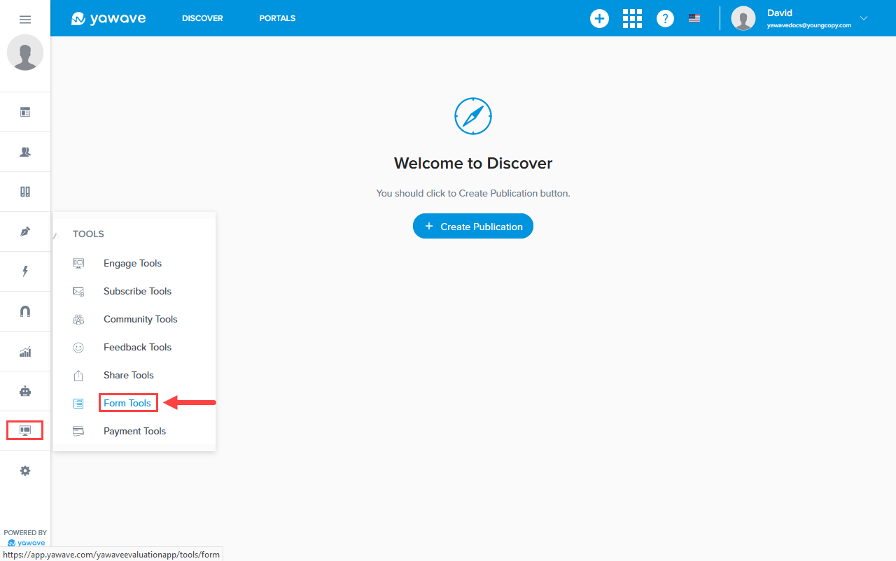
- Click Tools/Form Tools.
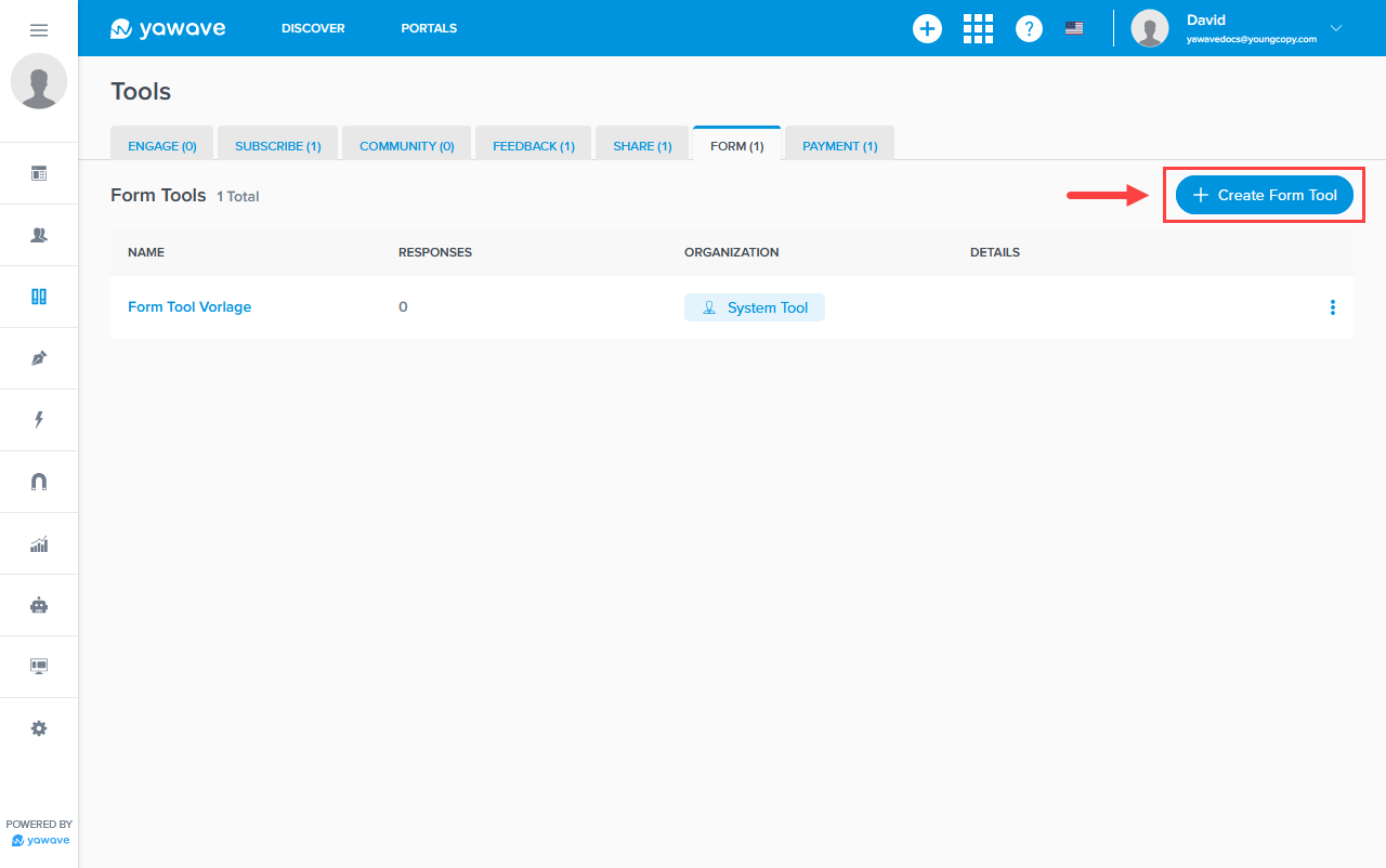
- Click Create Form Tool.
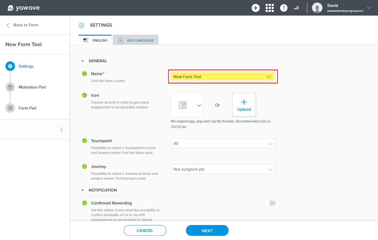
- Enter a name of your choosing in the Name field. Note: This field has a 80 character limit.
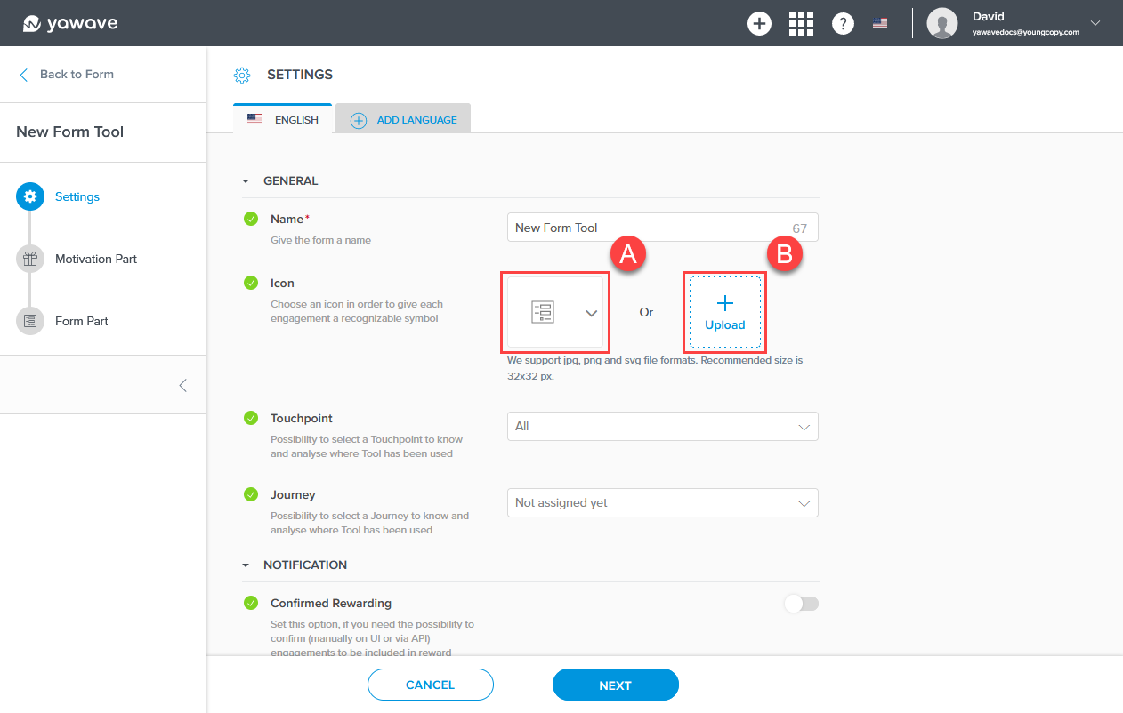
- Here you have two choices: use one of the icons provided by yawave (A) or create your own icon and upload it (B) to use with the Form Tool you are creating. The icon you choose or create will be shown on the Form Tools button you place on the Tool(s) you connect.
- The Touchpoint and Journey settings are optional and require more advanced understanding of the yawave product. If you are already familiar with these settings and how they work, complete the following, otherwise continue to Step 6.
- Select Add Touchpoint from the drop-down menu.
- Select a Journey from the drop-down menu or select Add Journey to create a new one.
-
Confirmed Rewarding is an advanced setting. Documentation coming soon.
-
The Auto. Email Response to Submitter setting requires a "Thank you for submitting your information" email template that yawave sends to a user after they submit their information. Note: The template can be any name and have any content you want to use, but do note the template will be sent to the user after they submit the Form Tool form. If you have not done so already, Create an Email Template. Once you have created your email template, start typing the name in the Auto. Email Response to Submitter field. Continue typing the name until your template appears. When your email template appears, click the email template from the drop-down menu. The Auto. Email Response to Submitter setting should show your "Thank you for submitting your information" email template. Next, enter a subject you want to include with the email every time it's sent to the user.
If you have created an email template you want to use for the Auto. Email Response to Submitter email and it does not show up in the list, you'll need to refresh the page.
- The Auto. Email Notification to... setting is similar to the Auto. Email Response to Submitter setting in Step 7 above. The difference is the Auto. Email Notification to... email is sent to the person responsible for managing the information collected from the user. For example, the email will be sent to your yawave administrator or anyone on your team who needs to have a record of who submitted their information. The Auto. Email Notification to... setting requires an email template that yawave sends to an administrator or someone keeping records after the user submits their information. Note: The template can be any name and have any content you want to use, but do note the template will be sent after the user submits the Form Tool form. If you have not done so already, Create an Email Template. Once you have created your email template, start typing the name in the Auto. Email Notification to... field. Continue typing the name until your template appears. When your email template appears, click the email template from the drop-down menu. The Auto. Email Notification to... setting should show your email template. Next, enter a subject you want to include with the email every time it's sent to the user.
If you have created an email template you want to use for the Auto. Email Notification to... email and it does not show up in the list, you'll need to refresh the page.
-
Assign Contact To is an advanced setting. Documentation coming soon.
-
For the Completion Behavior setting you have two options: restart the Form Tool from the beginning or redirect the user to a link you choose. Completion Behavior shows Restart Form Tool as default. This means the Form Tool will start over once the user has submitted their information. If you want to redirect the user to another page, link or URL, click URL Redirect from the drop-down menu, wait for the page to refresh and then add the link/URL to the page you want to redirect your user to in the text field.
-
Click Next.
-
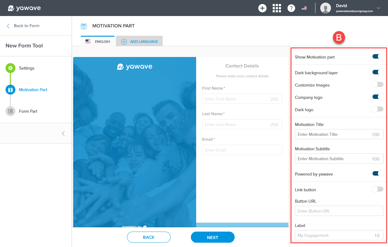
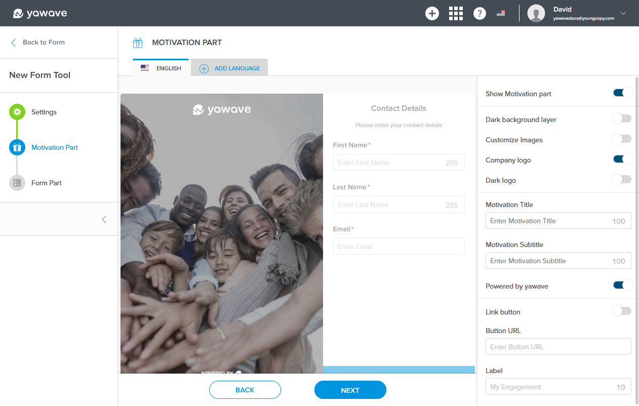
Below you'll see two images. (A) shows the Form Tool Motivation Part output and (B) shows the Form Tool Motivation Part settings. The settings you change in (B) will reflect in the output (A). Note: The Form Tool Motivation Part output is an image and should entice your visitors to fill out the fields you configure in the Form Tool.
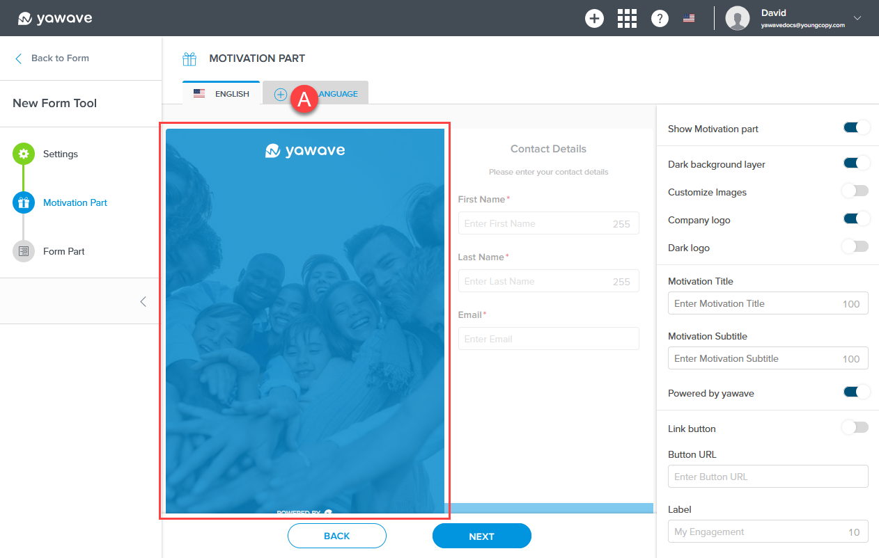
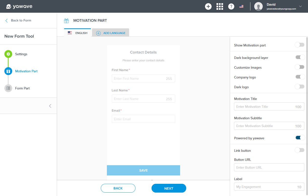
- By default Show Motivation part is enabled. If disabled, the image and Form Tool Motivation Part output will not be shown. If you do not want the Form Tool Motivation Part output to be shown, click the toggle once to disable this feature.

When Show Motivation part is disabled, the Form Tool Motivation Part output will look similar to the following image.
- By default Dark background layer is enabled. If disabled, the image background color (in this example, blue) will not be shown. Click the toggle once to disable this feature.
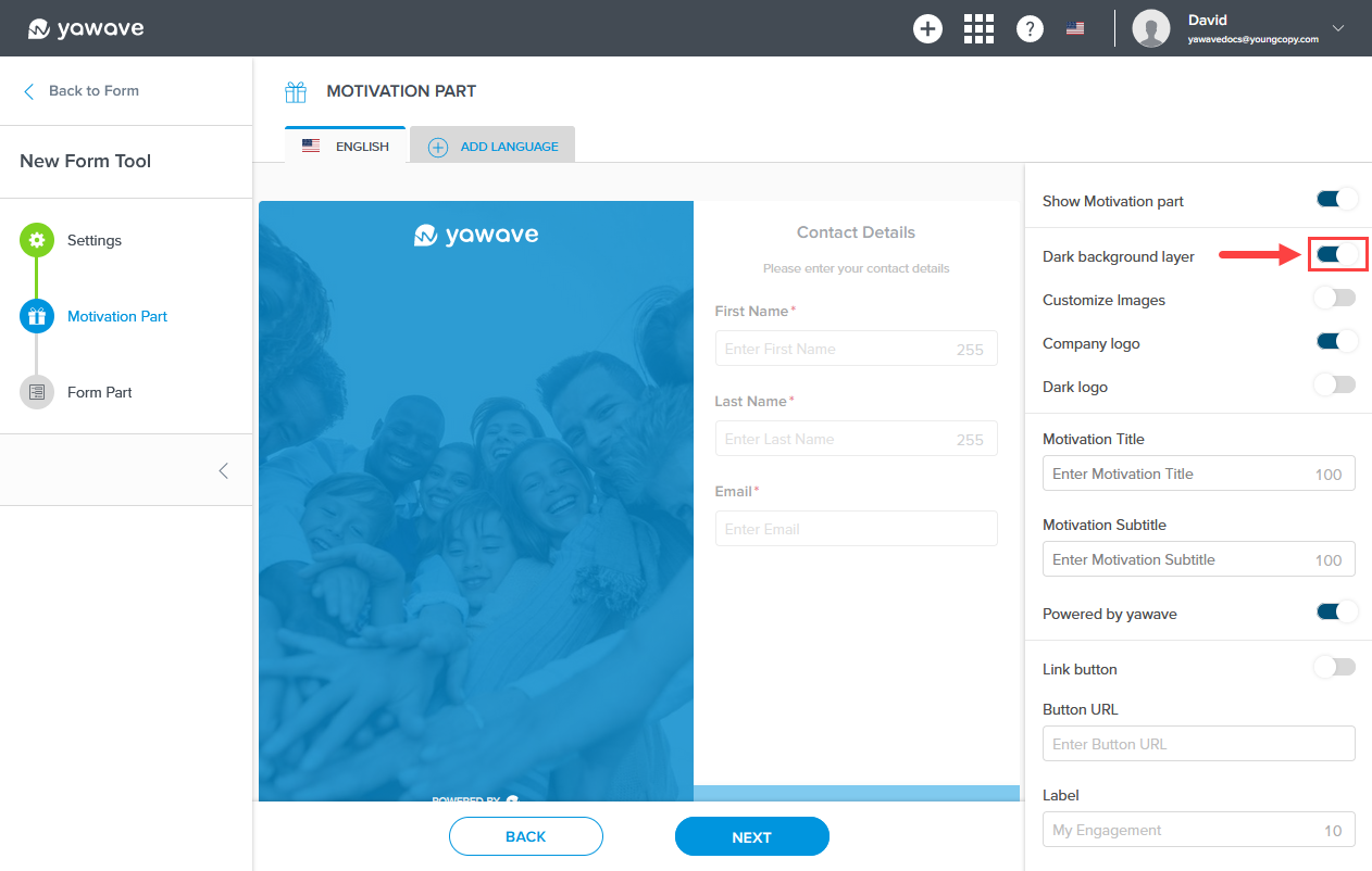
When Dark background layer is disabled, the Form Tool Motivation Part output background will look similar to the following image.
-
By default Customize images is disabled. To change the Motivation Part cover or image, click the toggle once to enable this feature. If enabled, follow the instructions below, otherwise continue to Step 16.
a. Here you'll need a Portrait Image (400x580) 200KB. Once you have the Portrait Image you want to use, drag and drop the image or click to upload.
b. Here you'll need a Landscape Image (768x400) 200KB. The Landscape Image is used to represent the Form Tool in mobile screen sizes. Once you have the Landscape Image you want to use, drag and drop the image or click to upload. -
By default Company Logo is enabled. If disabled, the logo (in this example, yawave) will not be shown. Click the toggle once to disable this feature. Note: The Company Logo is set when you Configure Branding.
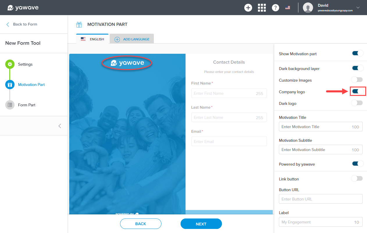
When Company Logo is disabled, the Form Tool Motivation Part company logo will be removed and look similar to the following image.
-
By default Dark logo is disabled. If enabled, the white logo (in this example, yawave) will be shown as a dark logo. Click the toggle once to change the white logo to a dark logo. Note: This applies to the logo in Step 16 above.
-
Enter motivational text in the Motivation Title field. (Note: This field has a 100 character limit.) While entering the motivational text you will see it appear in the Motivation Part.
-
Enter motivational text, to be shown as a subtext, in the Motivation Subtitle field. (Note: This field has a 100 character limit.) While entering the motivational text you will see it appear in the Motivation Part.
-
By default Powered by yawave is enabled. If disabled, the image will not be shown. Click the toggle once to disable this feature.
-
By default Link button is disabled. When enabled a clickable button appears. Click the toggle once to enable this feature. If enabled, follow the instructions below, otherwise continue to Step 22.
a. Enter the URL or link you want the button to go to in the Button URL field.
b. Enter the text you want to be shown on the button in the Label field. (Note: This field has a 23 character limit.) -
Click Next.
-
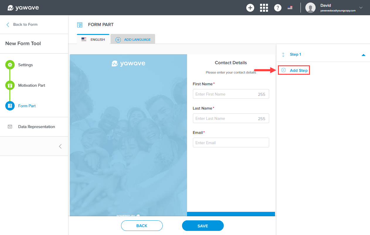
Below you'll see two images. (A) shows the Form Tool Form Part output and (B) shows the Form Tool Form Part settings. The settings you change in (B) will reflect in the output (A). Note: The Form Tool Form Part output contains fields and steps your users can take when filling out your Form Tool form based on what you choose in the Form Part settings.
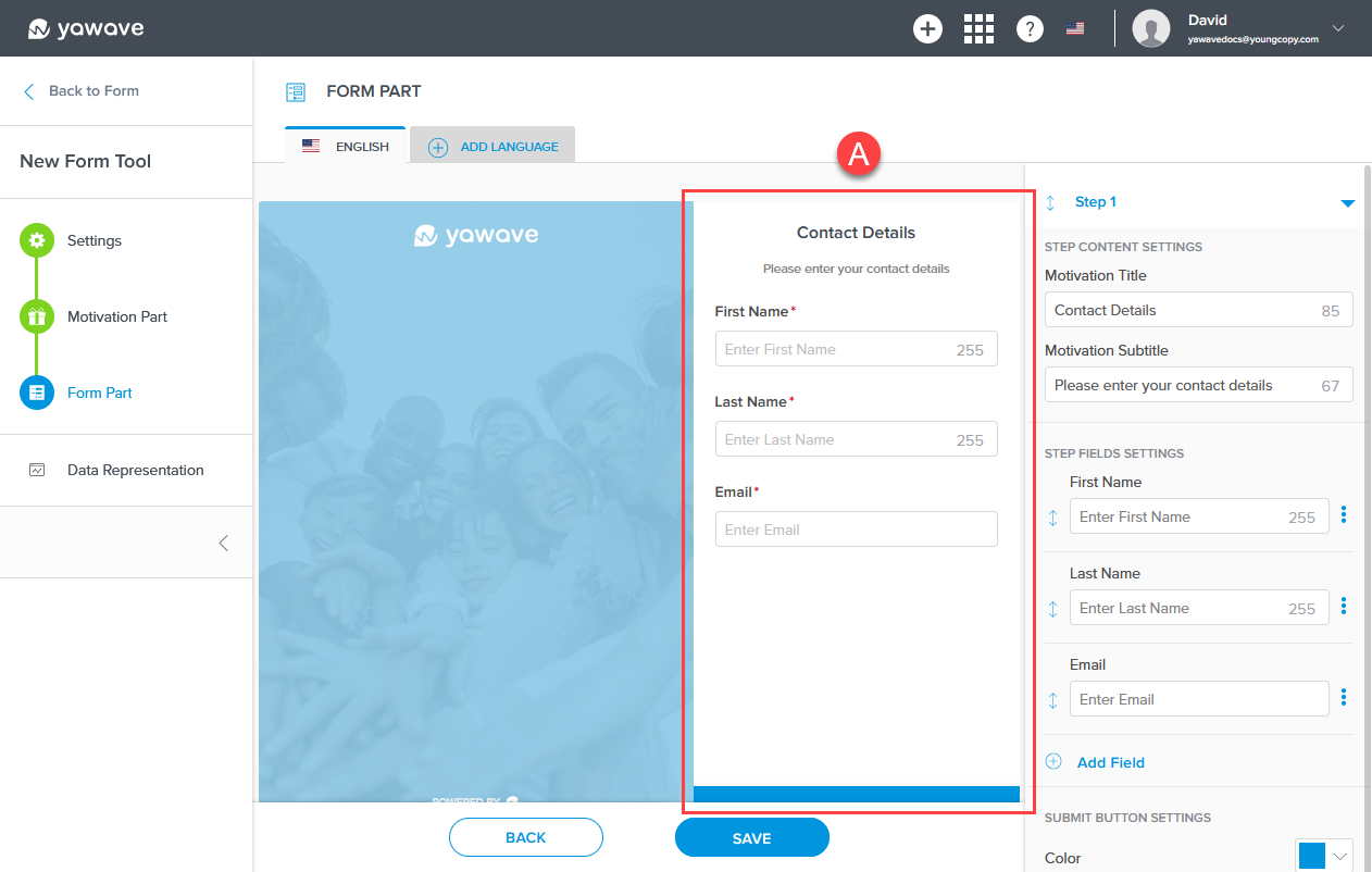
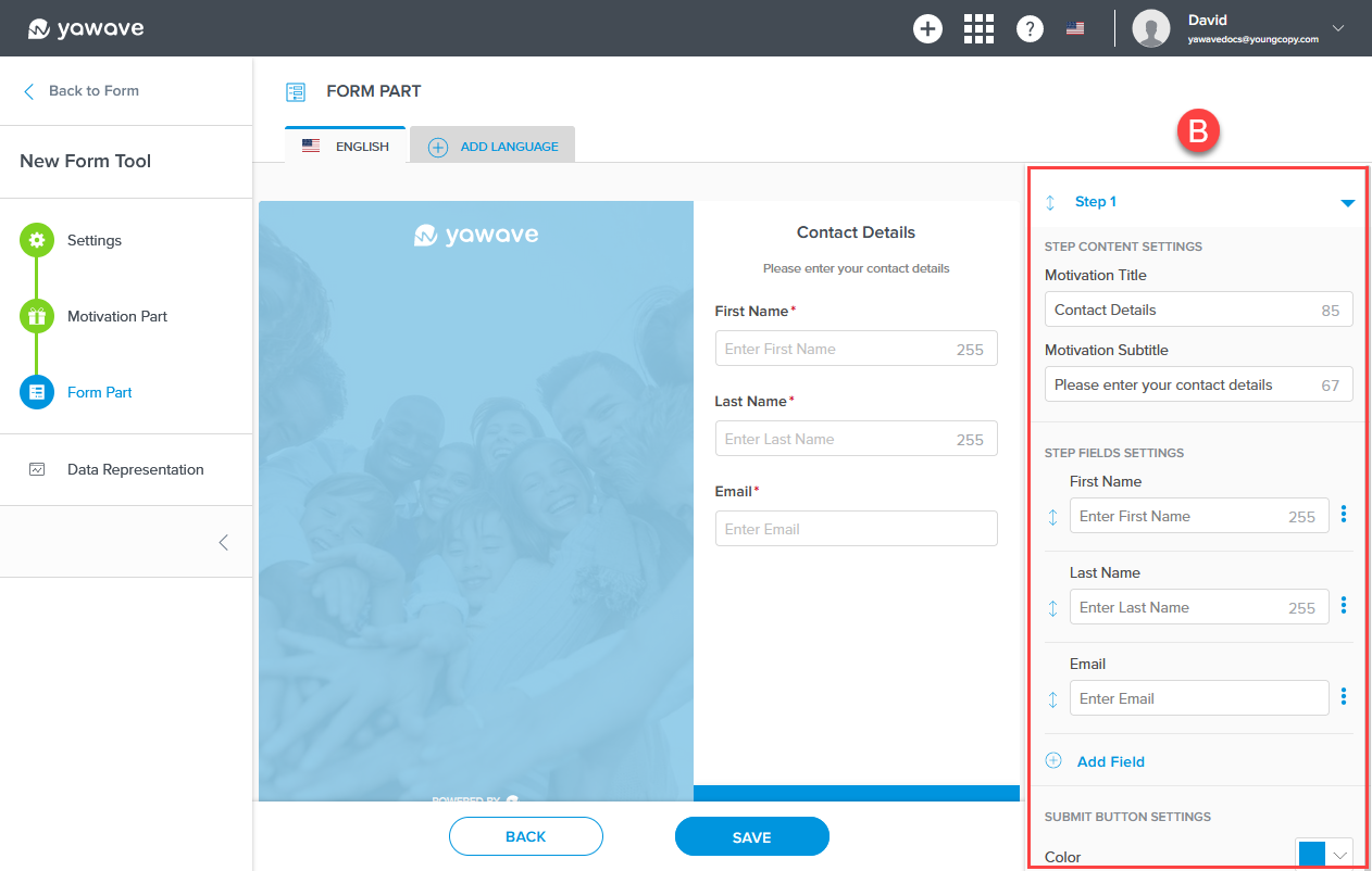
The Form Tool comes with one predefined step (B) that you can customize at any time. The one default step (Step 1) contains Contact Details such as First Name, Last Name and Email address.
Click and drag the double arrow to the left of the field to move the field up or down.

Click Add Field to add an additional field.
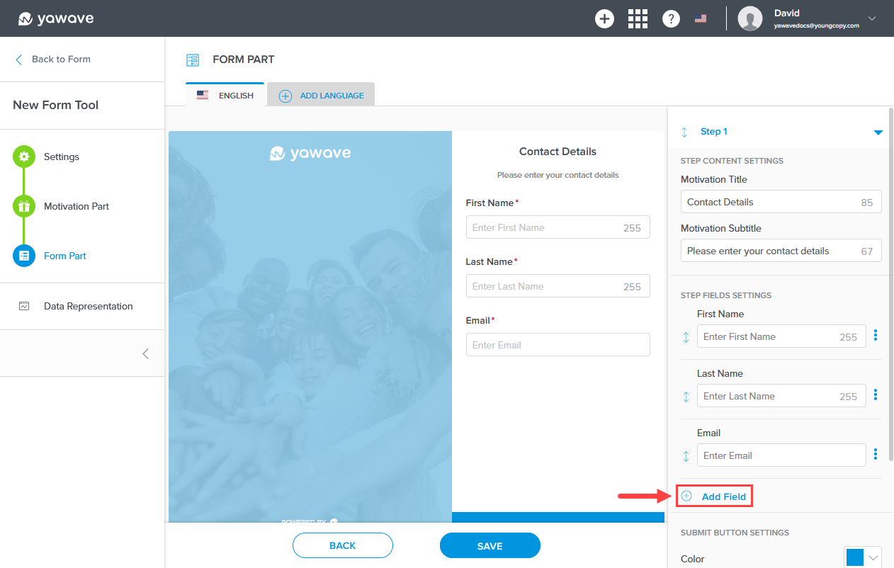
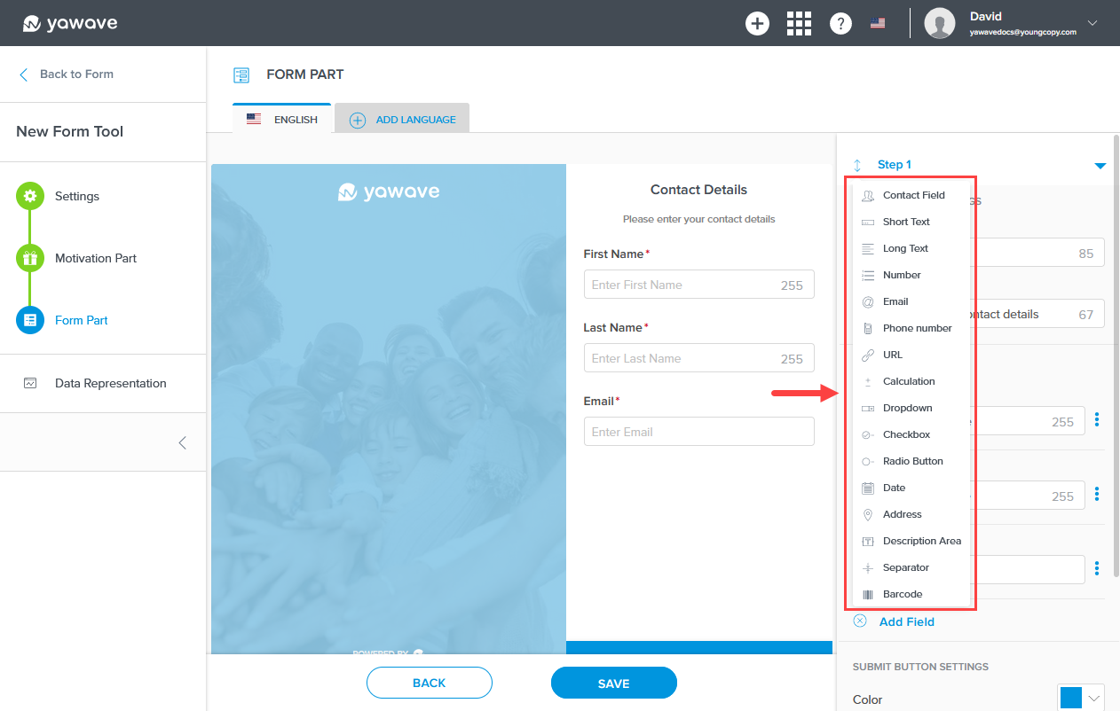
Select the field you want to use from the Field list.
Click the three dot menu to the right of the field you want to edit, then click Edit. Or click Delete to remove the field.

Click the Step 1 arrow. Note: You can click any step arrow at anytime to open the step's settings. In this example, the arrow is pointing down, which means the settings will be shown. When the arrow is pointing up, the settings for that step will not be shown.
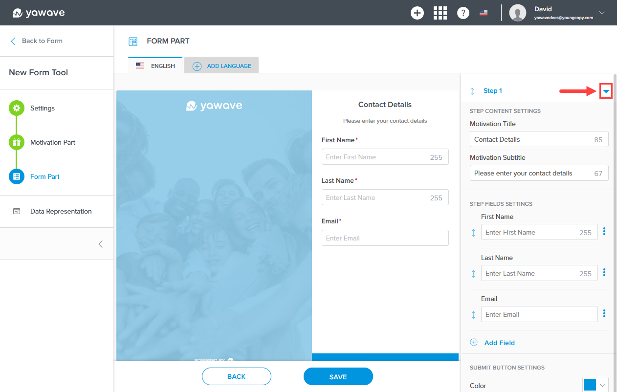
When you click the Step 1 arrow you should see the one default step. Note: If you don't see the one default step, you may have the step's settings expanded. Click the step's arrow to the right until the step is shown similar to the image below.

Click Add Step to add an additional step. Note: When creating additional steps in the Form Tool, yawave automatically adds another screen to the form.
Using what you learned above, make adjustments to your form (add, edit or delete steps and fields).
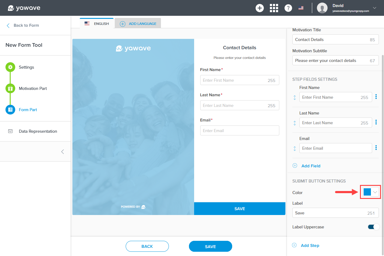
- Next you'll need to configure the Save button settings. The Save button is shown in the image below.

Select the color you want to use for the Save button from the Submit Button Settings drop-down menu. Here you can enter a Hex value, RGB value or use the color picker.
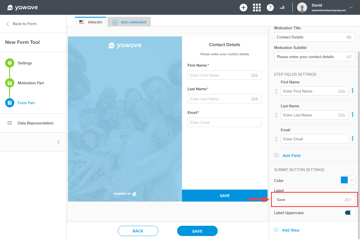
Enter the name you want to use for the Form Tool label in the Label field. Note: This field has a 23 character limit.
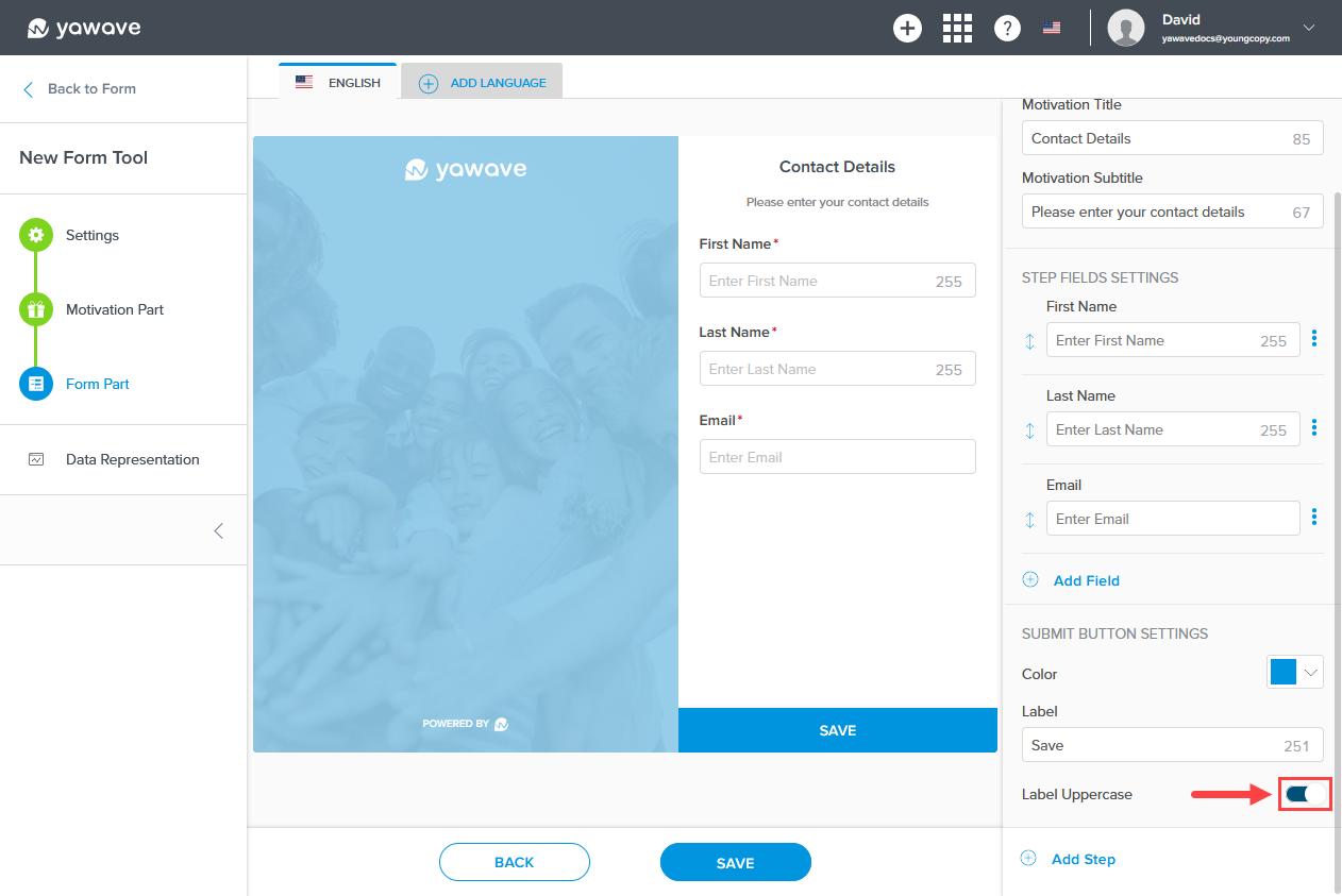
The Label Uppercase setting changes the Save button label to lowercase or uppercase. When the Label Uppercase toggle is enabled (the default setting), the Save button label will be shown as uppercase. When the Label Uppercase toggle is disabled, the Save button label will be shown as lowercase. To show the Save button label as lowercase, click the Label Uppercase toggle once.
- Click Save.
Create and configure Categories or review Onboarding Steps.